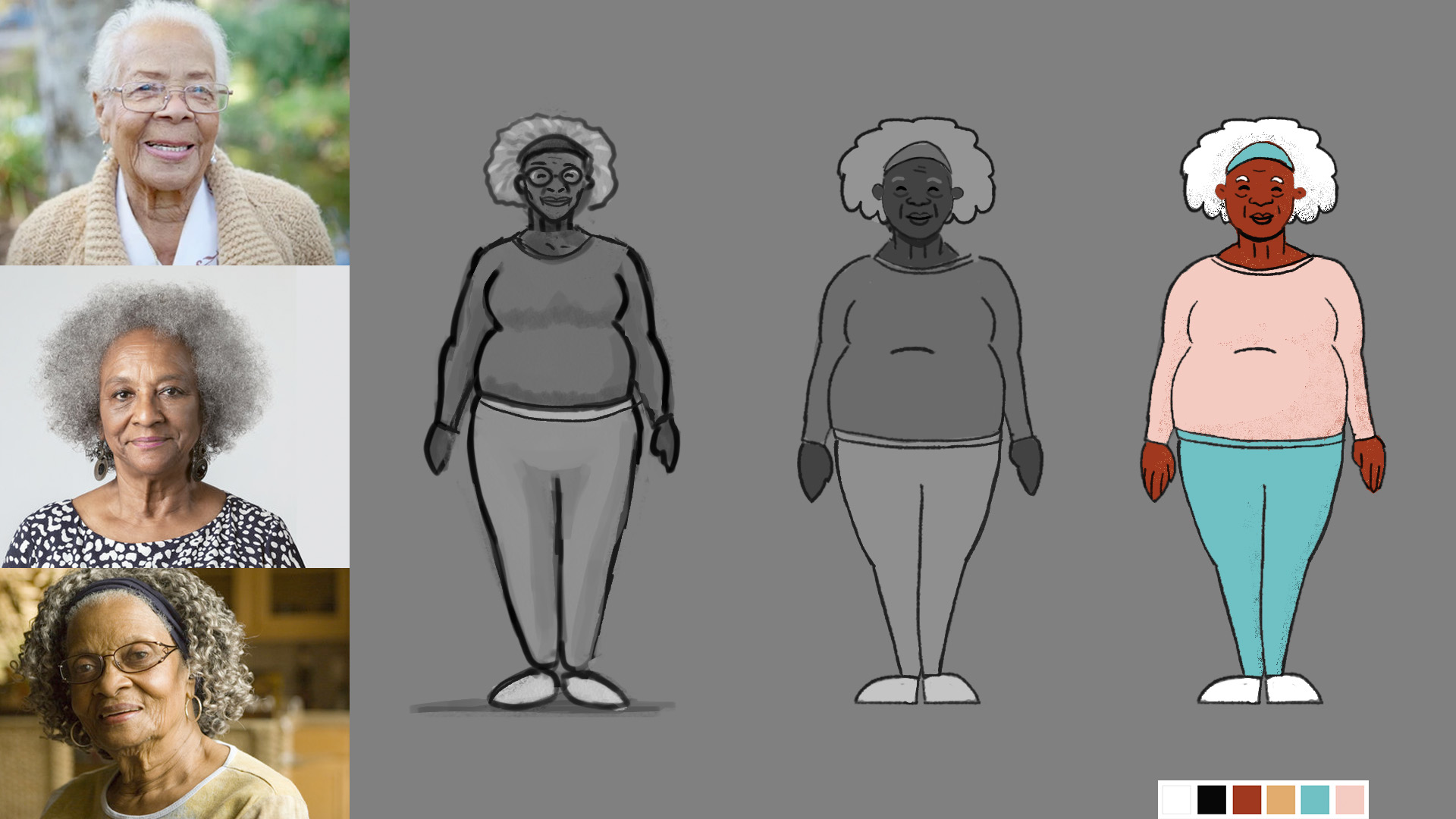
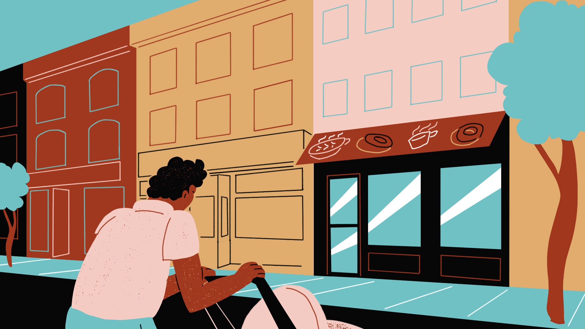
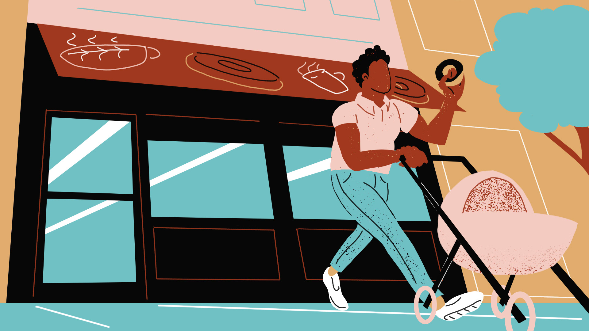
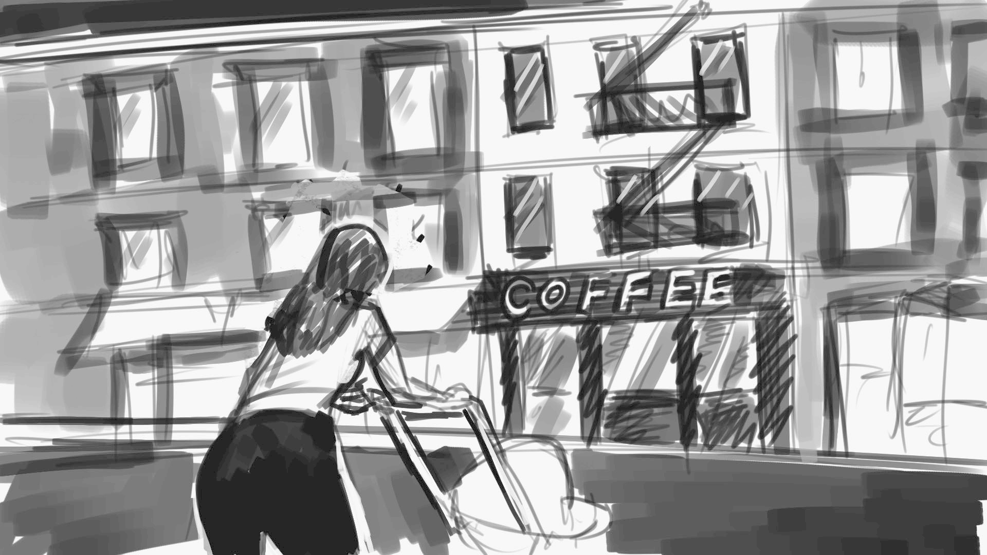
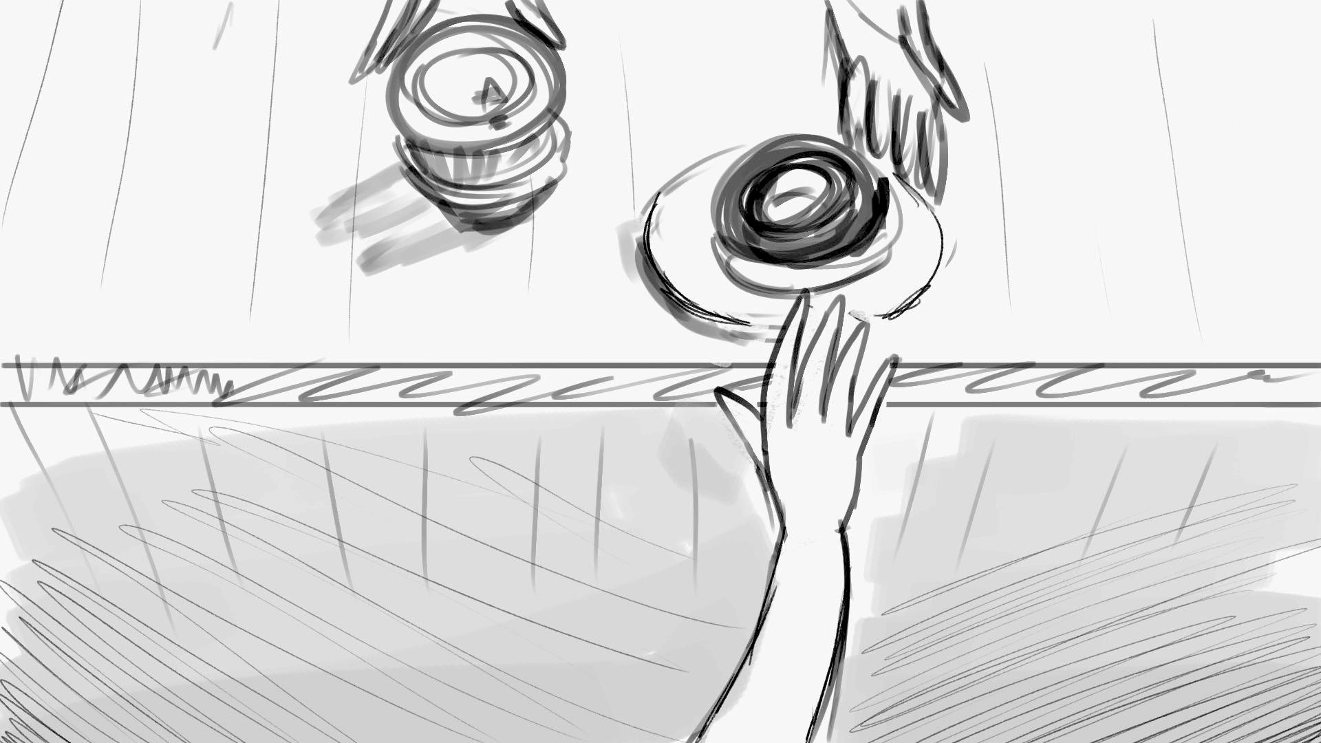
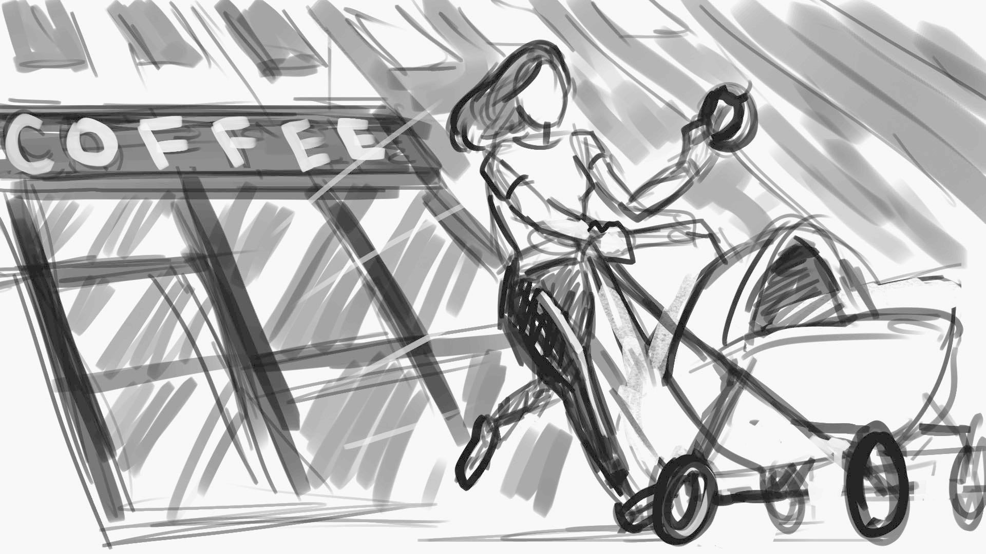
“Normal Donuts” animation


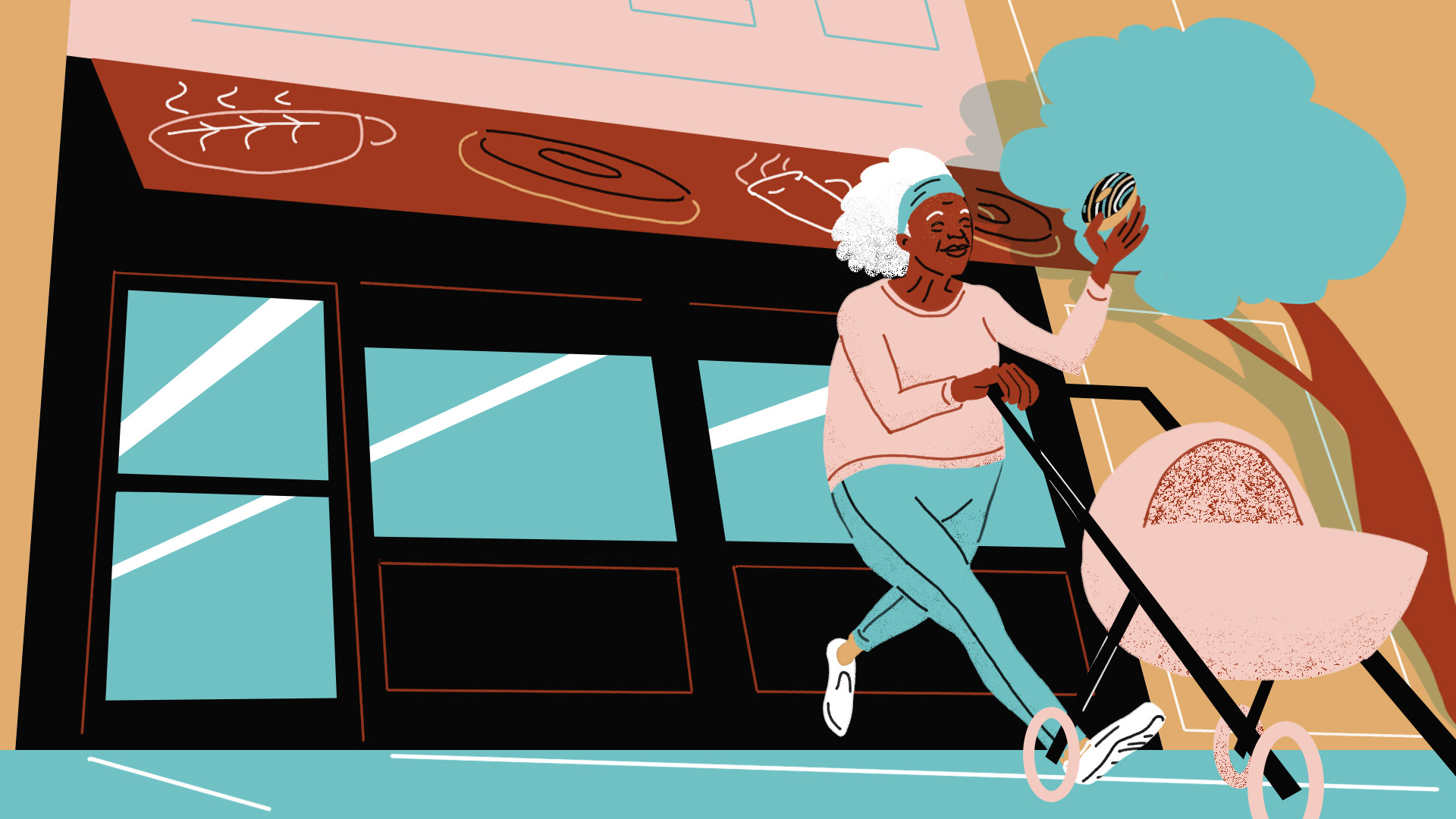

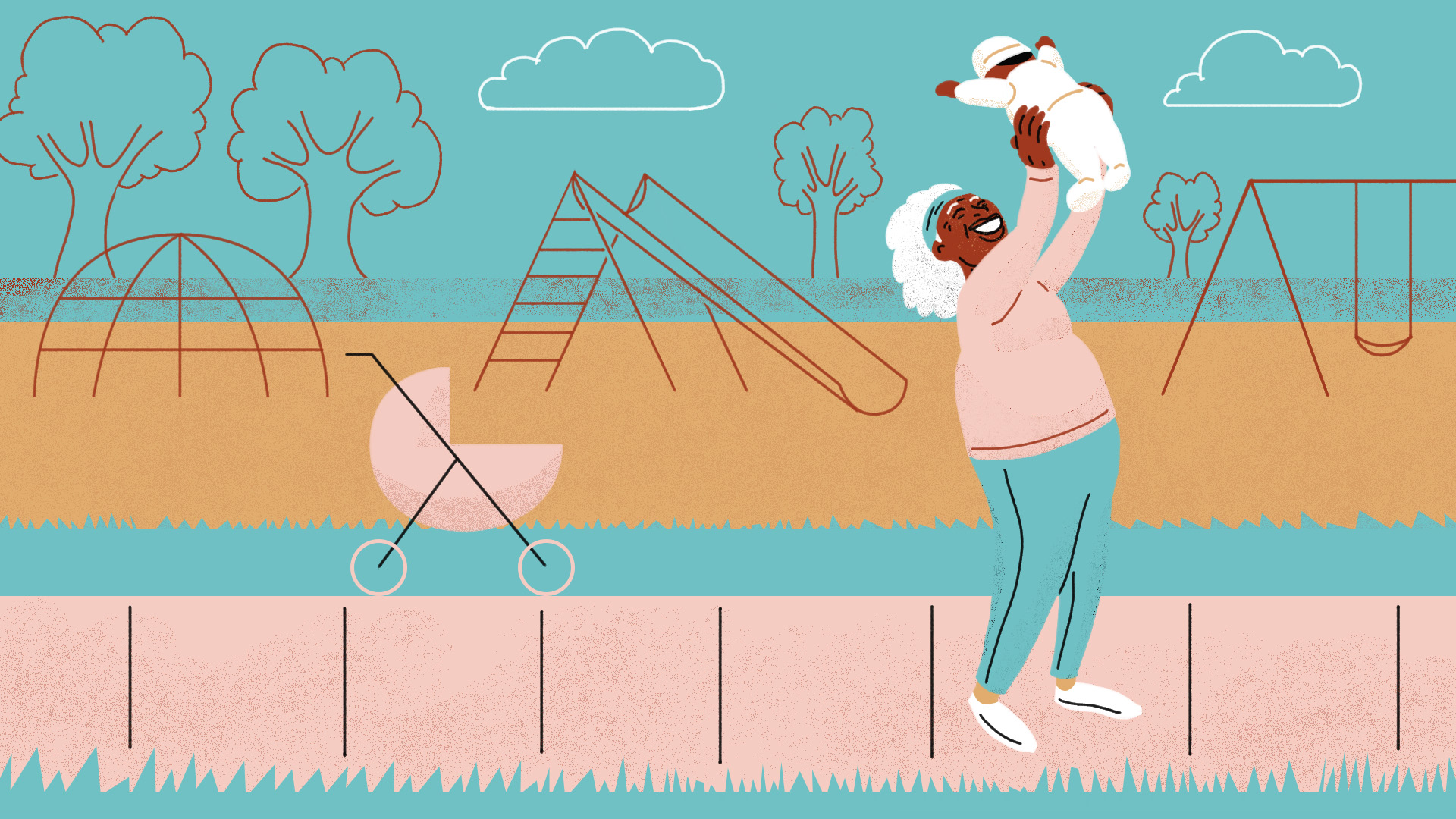

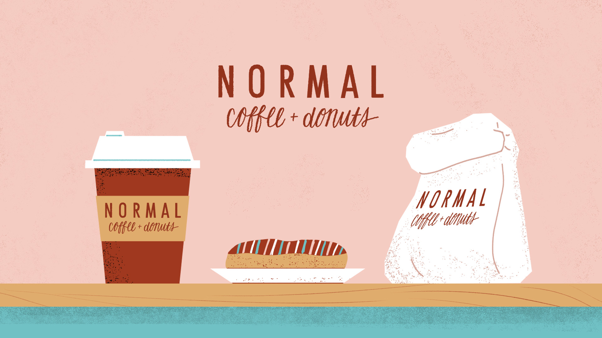

Project for the School of Motion course “Illustration For Motion” taught by Sarah Beth Morgan and Anne Saint-Louis. Within the course, we were imagined to be illustrators in a creative agency, and we were handed a brief and script from a fictional client who wanted to create a 15-second animated advertisement for their donut café. The spot would feature an African-American woman as the protagonist, and she would engage in some busy activity before seeking a “pick-me-up” from the café, then resuming her day with renewed energy. We had the freedom to develop our own story concept from that brief, and from there we had to create style frames that brought that concept to life. In the workflow in a real agency, the style frames would then be passed on to an animation team. That animation phase was outside the scope of the course, but I decided to create that animation myself in Moho several months later.
In an earlier phase of the assignment, we began with a more abstract male character. Later, the fictional client returned with a new budget and timeline, and asked us to iterate the protagonist into a more expressive character.
Additional video credits
Script: School of Motion
Music: “Calling California” by Streambeats
Sound effects: Adobe Audition Sound Library, freesound_community/Pixabay, DOBCommunications/Pixabay
Voiceover: me LOL


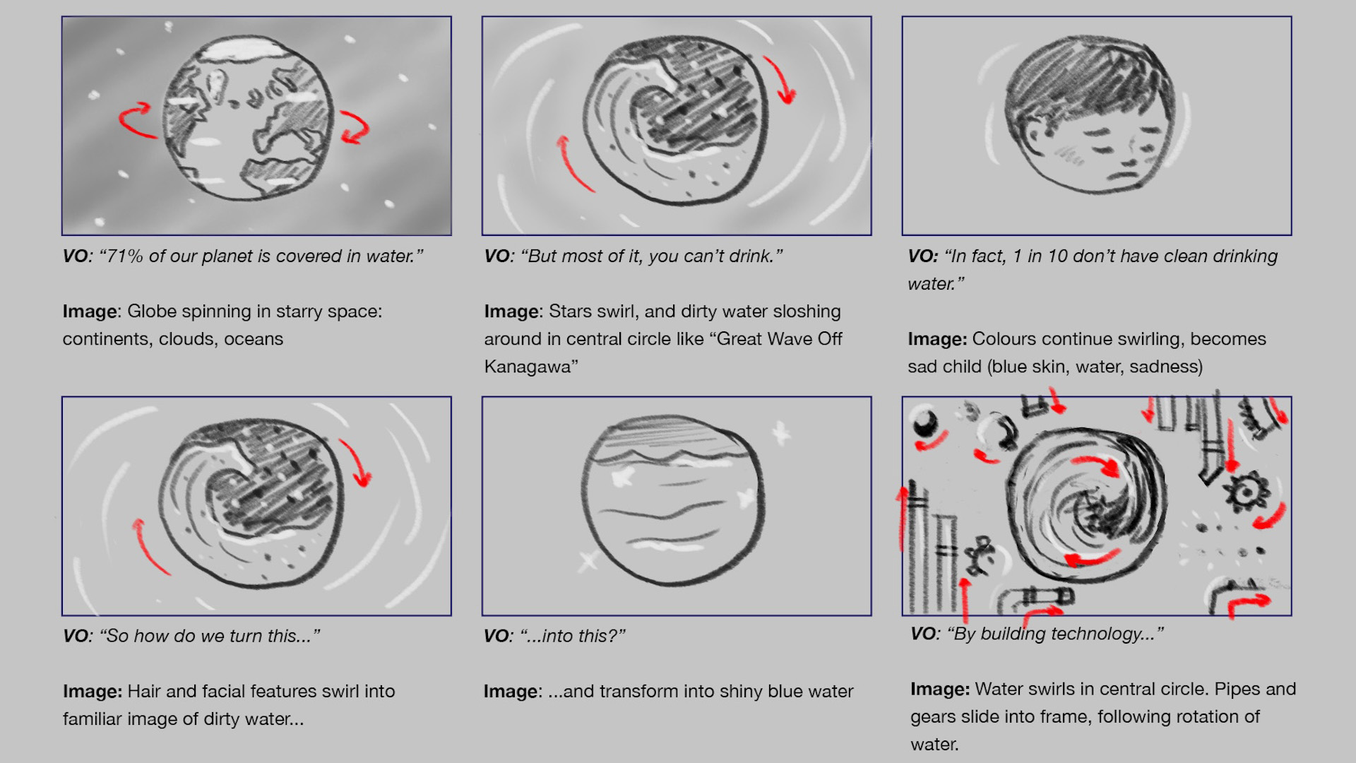
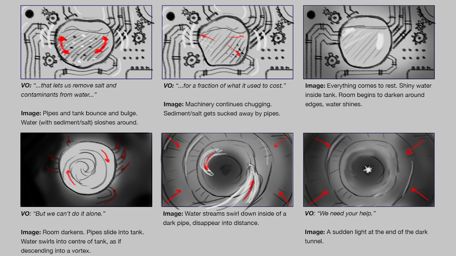
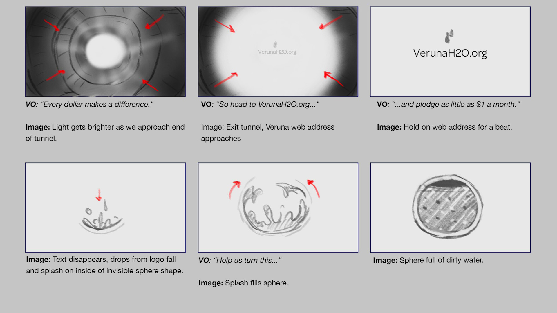
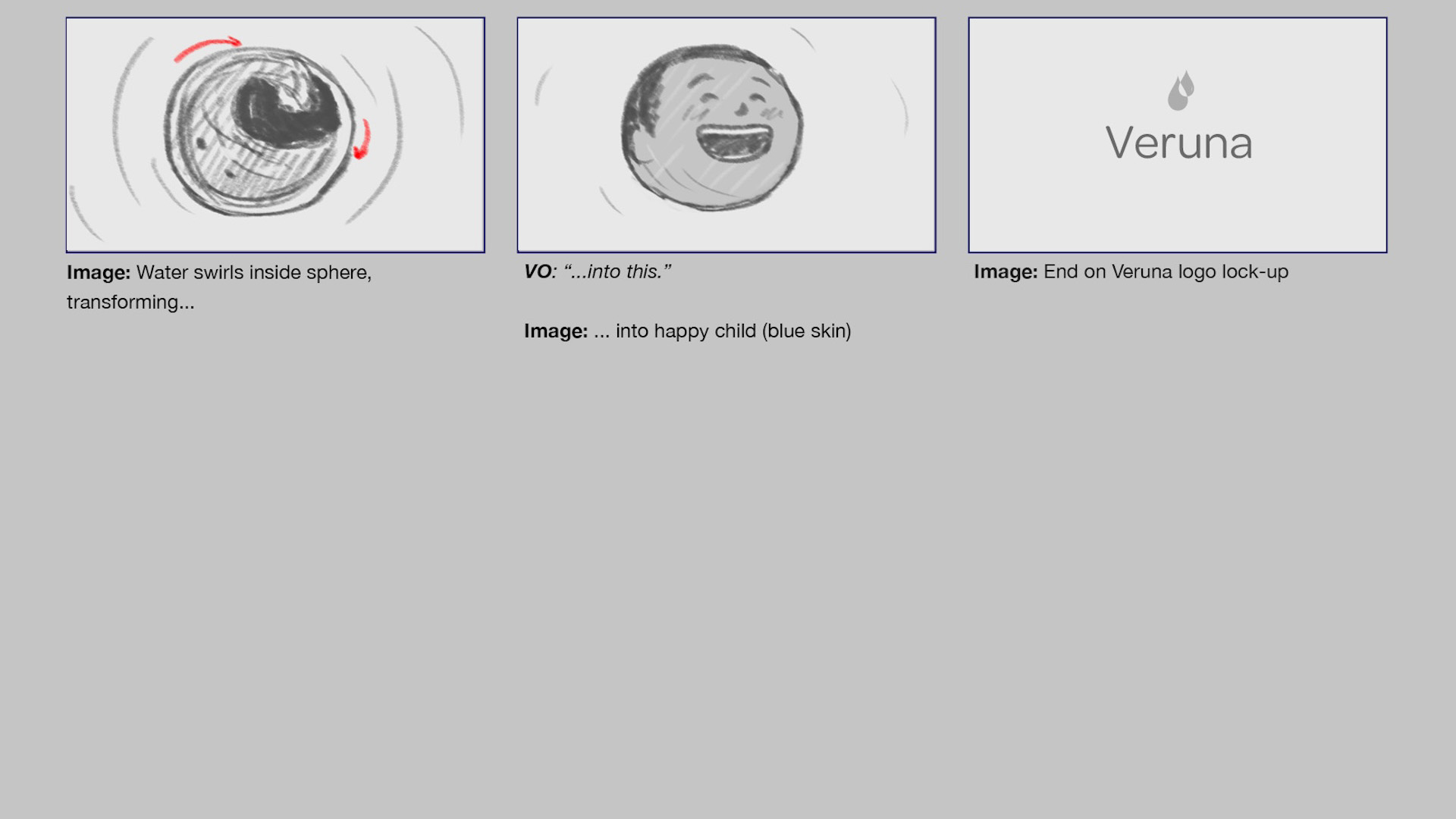
“Veruna” explainer animation
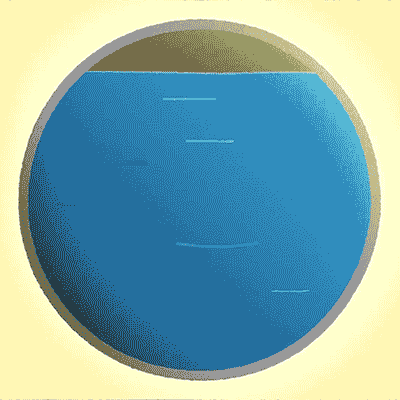
Final project for the School of Motion course Explainer Camp, taught by instructors Jake Bartlett and Coralie Legrand.
We had to make a short animation from one of three fictional client briefs, and I selected this fundraiser for a fictional NGO called Veruna. The script and voiceover were supplied by the course, while we had to develop a visual treatment that brought it to life, then design it and animate it. This was all done in After Effects, with some bits in Photoshop and Illustrator and Animate.
I organized the design and composition around a circle, and carried that forward from shot to shot. It ended up being, essentially, one continuous shot from beginning to end, which meant the elements had to morph from one sequence to the next. The overall effect seems simple, but it required a lot of story editing and animation grunt work to tie everything together. Along the way, I managed to squeeze in a few visual metaphors like a light at the end of a tunnel, and a proverbial drop in the bucket.
One of my other concepts for this brief would have had more character animation, which I thought would be more difficult than this (“This is going to be too simple!”), but these morphs were more labour-intensive than I realized. It took several passes and different methods before I figured out how to do those morphs in a satisfactory way. As I learned, hand-animating a complex morph isn’t exactly the most efficient way of doing it. But that’s what we’re in a course for: trying things, learning from failure, getting feedback, trying again.
It was quite a journey over the past three months, going from initial pitch concepts and storyboards, to animatics, to full animation. But this is the foundational workflow I need to master for the future, and this course was rigorous practice for that workflow. Looking forward to building on this foundation in the future.
Music: “What We Care About” by Tiny Music / Premium Beat
Sound Effects: Adobe Audition Sound Library


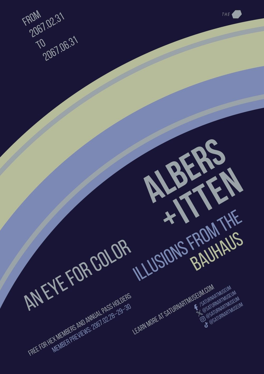
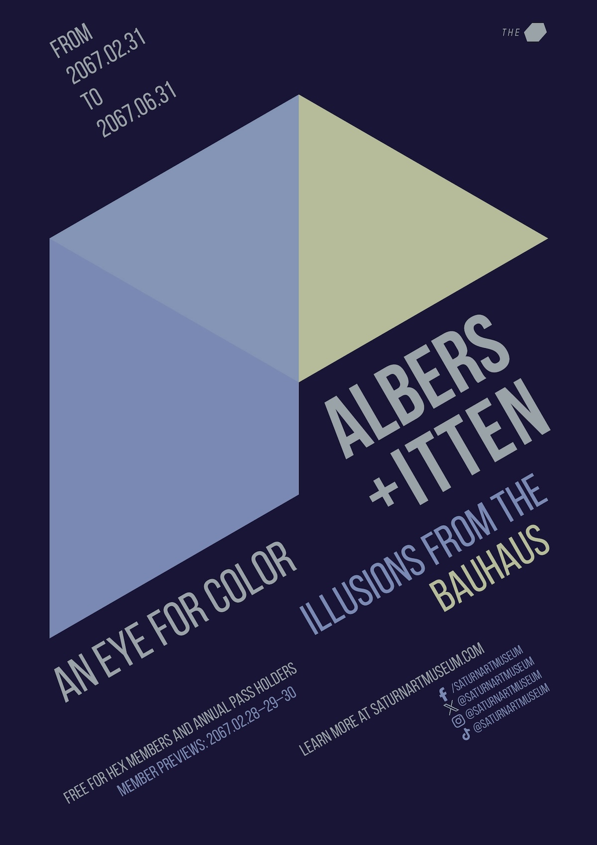
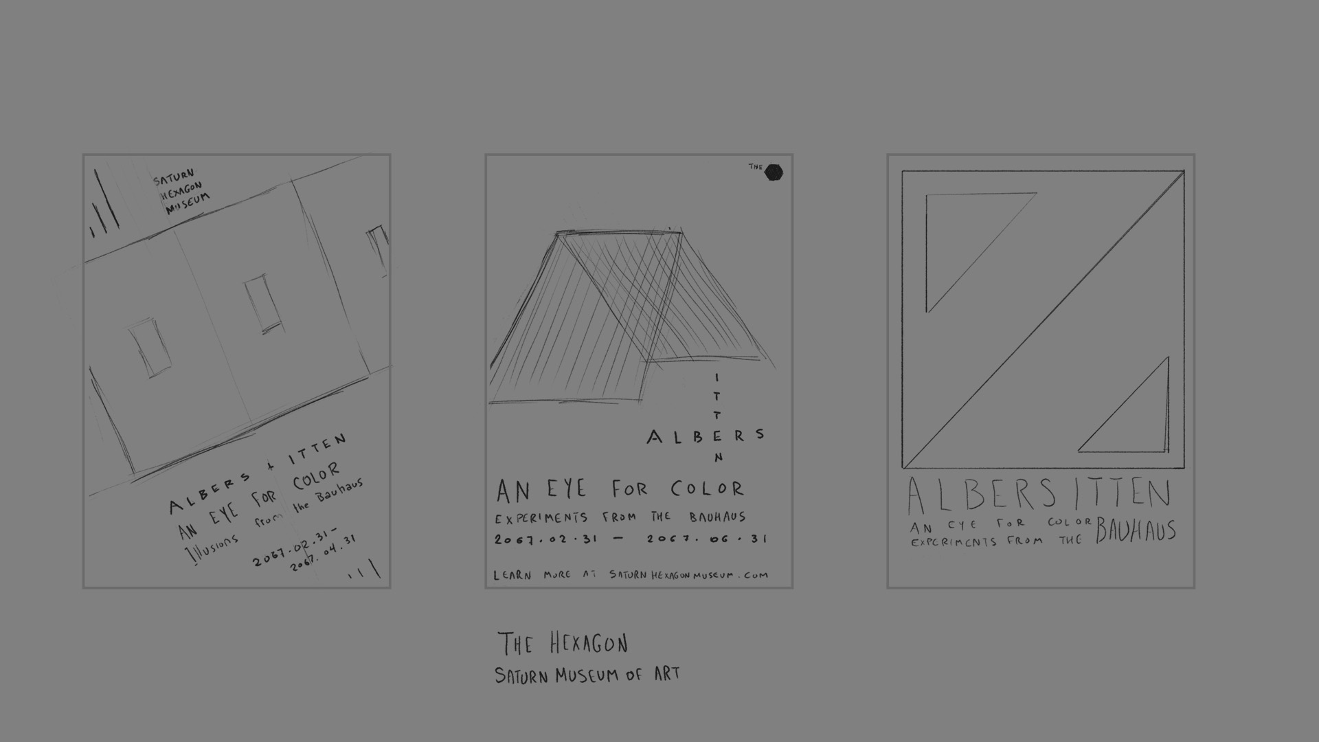
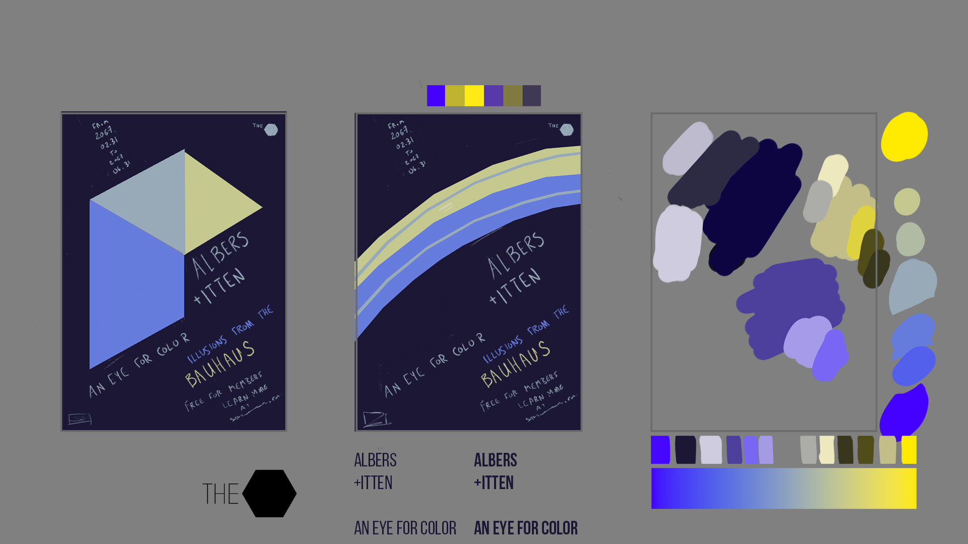
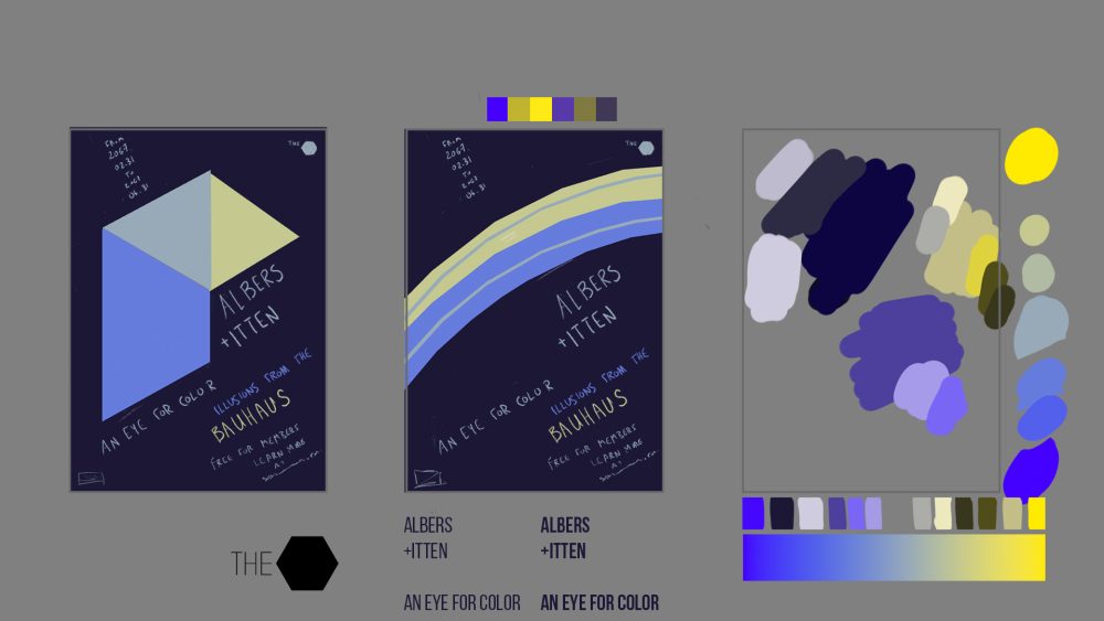
“Albers/Itten” animated display design

Final project for a Domestika course taught by Richard Mehl about the colour theory of Bauhaus designers Josef Albers and Johannes Itten. We had to create a museum poster for a fictional exhibition about illusions generated by their teachings. These illusions include the use of colour relativity to trick the eye into believing there are more or fewer colours in the image than there really are. For example, in the rings image, the thin rings inside the big rings are supposed to look like the opposite colour, even though they’re actually an entirely separate shade of grey. Then in the folding image, there’s an illusion of transparency created with different shades of colour rather than with blending modes or opacity changes.
I somehow decided this exhibition would take place in an art museum floating above the hexagonal cloud formation on Saturn’s north pole. Given that location, the museum would be nicknamed The Hex (the basis for its branding, seen in the upper-right corner). That location also influenced the design of the shapes and their colours. And yes, the dates of the exhibition take place in the future (and even on some impossible dates…maybe there’s a wormhole involved…).


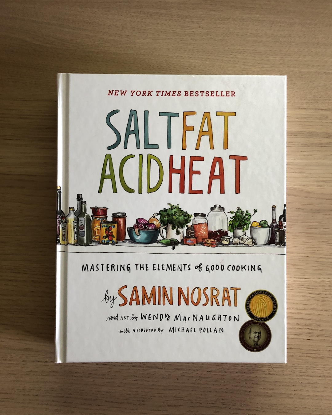
“Salt Fat Acid Heat” animated cover reveal
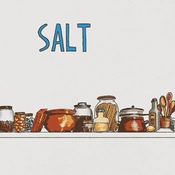
I wanted to study the designs of evocative book covers, then see if I could reproduce those designs myself, and add to them with little moments of delight to create animated cover reveals. I hope to eventually do more “editorial” animations based on book quotes, similar to TED-Ed videos. For now, I’m starting small and experimenting with style and technique.
This is student work. I’m not affiliated with the original creators.
Paper texture by Kyle T. Webster.
About the book
A cookbook that teaches the fundamentals of how and why specific flavours come together in a dish. Also a Netflix series.
Book credits
- Written by Samin Nosrat
- Illustrations by Wendy MacNaughton
- Cover design by Alvaro Villaneuva
- Published in 2017 by Simon & Schuster


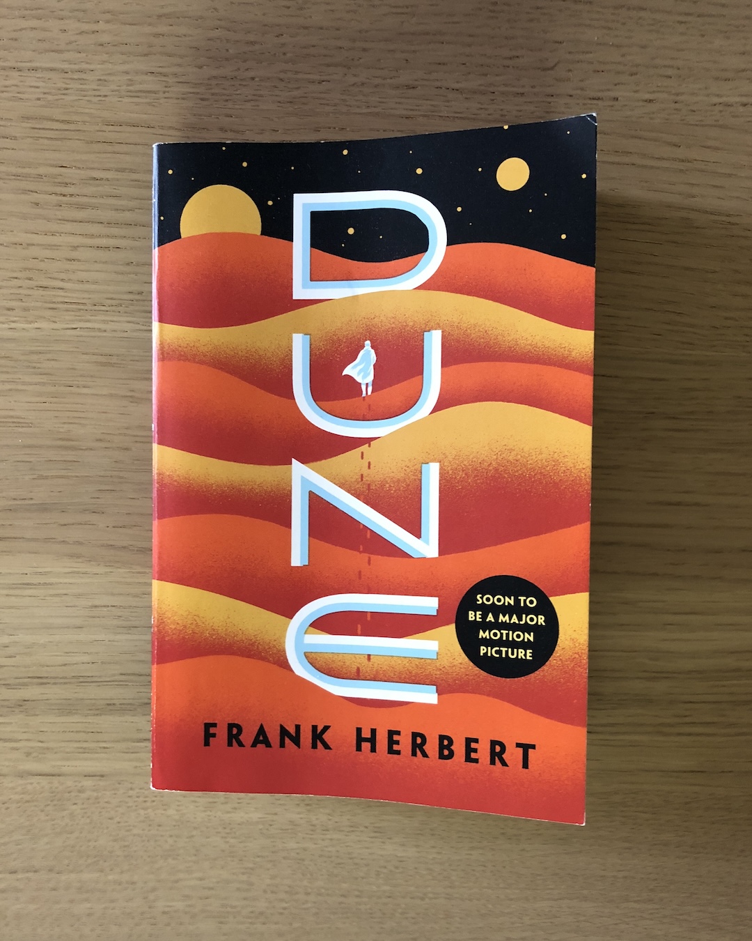
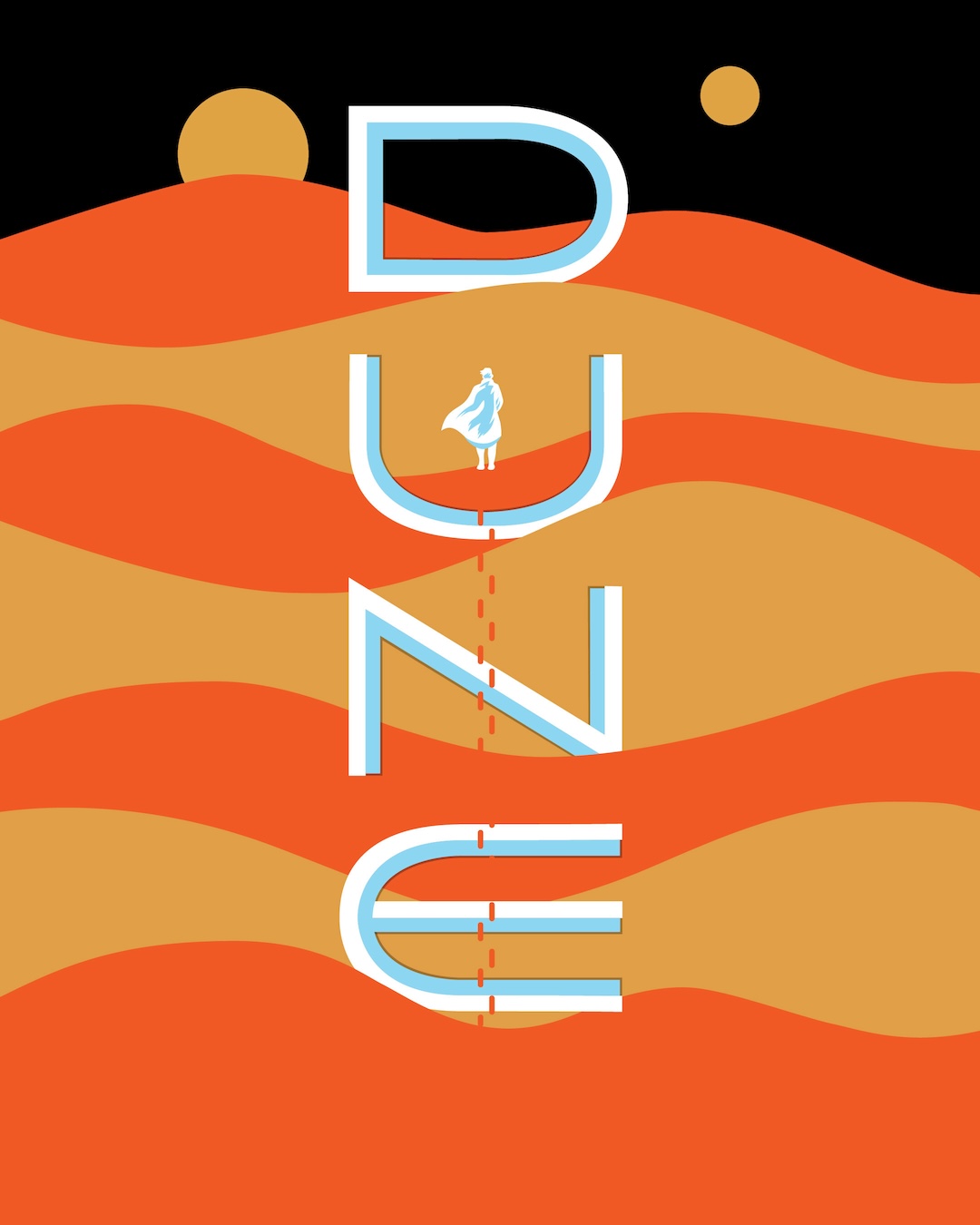
“Dune” animated cover reveal
I wanted to study the designs of evocative book covers, then see if I could reproduce those designs myself, and add to them with little moments of delight to create animated cover reveals. I hope to eventually do more “editorial” animations based on book quotes, similar to TED-Ed videos. For now, I’m starting small and experimenting with style and technique.
This is student work. I’m not affiliated with the original creators.
About the book
Scifi epic about space revolutions, psychic witch cults, giant worms and hallucinatory narcotics.
Book credits
- Written by Frank Herbert
- Cover design by Jim Tierney
- Art direction by Adam Auerbach
- Published in 1965 by ACE / Berkley / Penguin Random House


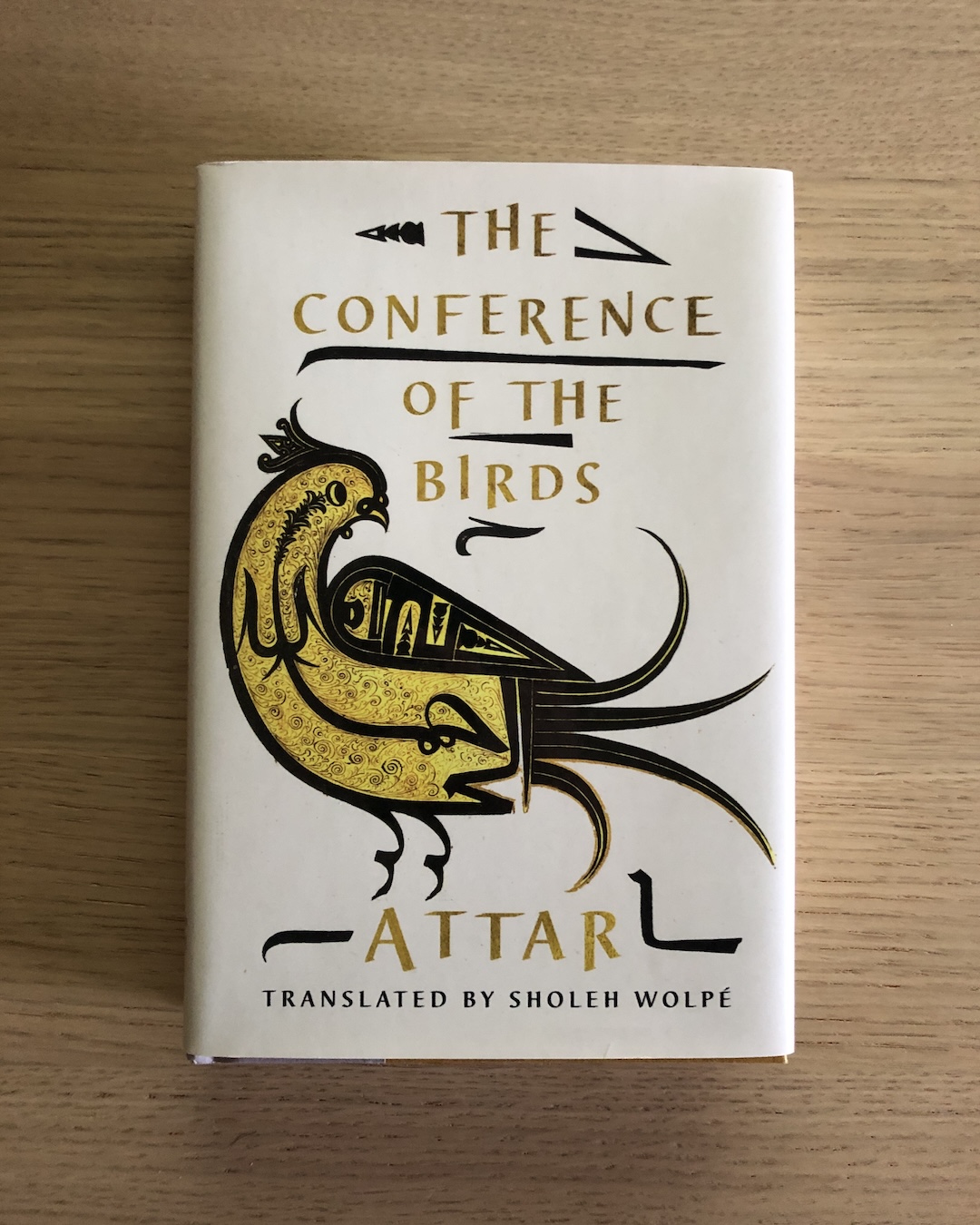
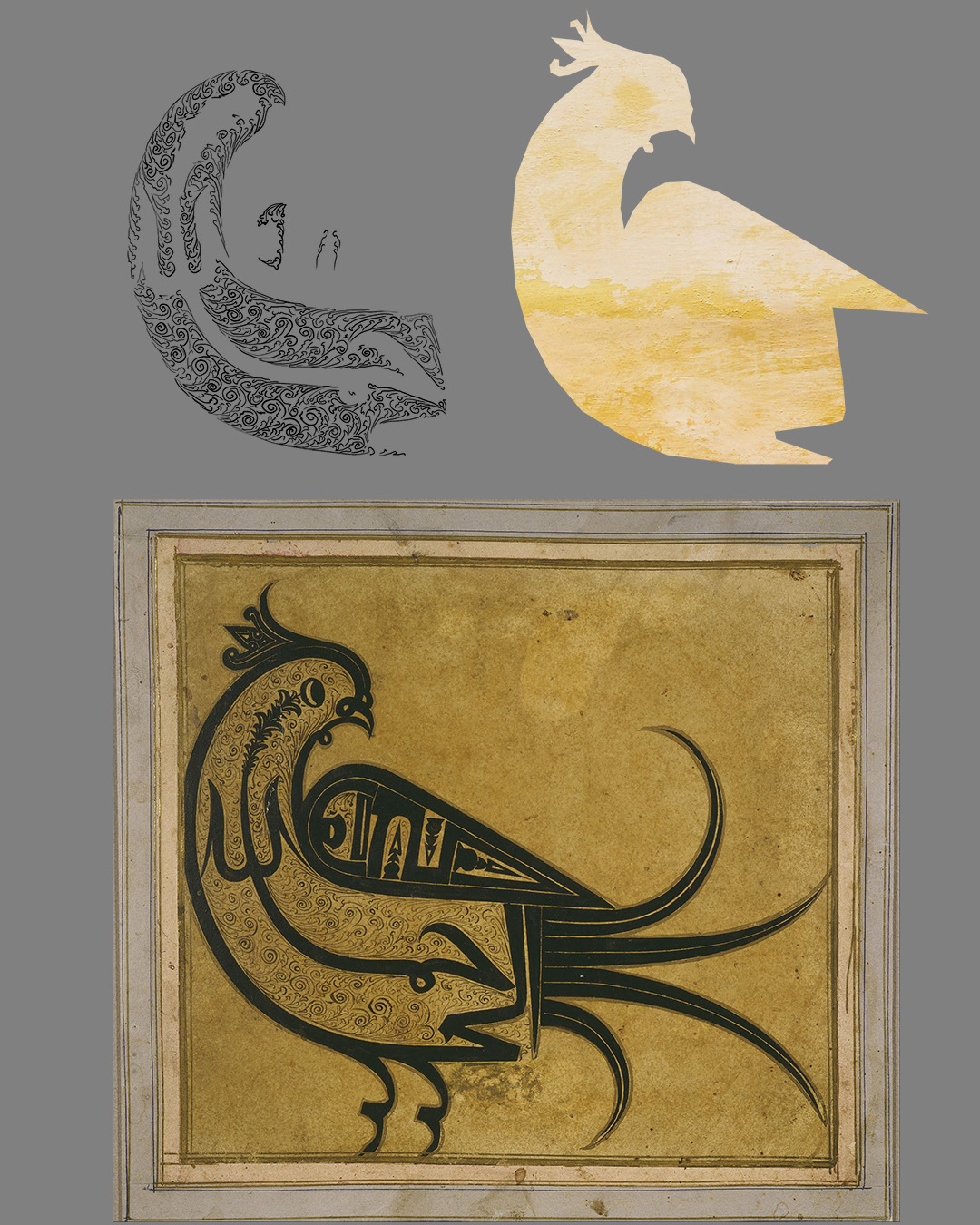
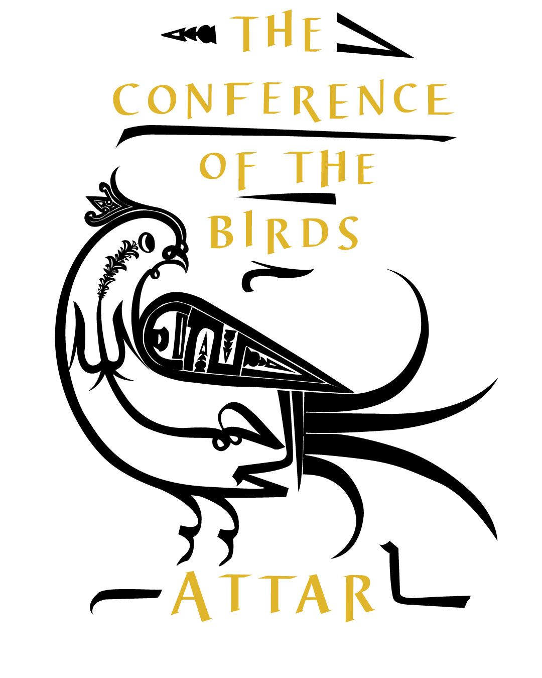
“Conference of the Birds” animated cover reveal

I wanted to study the designs of evocative book covers, then see if I could reproduce those designs myself, and add to them with little moments of delight to create animated cover reveals. I hope to eventually do more “editorial” animations based on book quotes, similar to TED-Ed videos. For now, I’m starting small and experimenting with style and technique.
This is student work. I’m not affiliated with the original creators.
Additional credits
- Canvas texture by Olga Thelavart
- Wall texture by Mona Eendra
- Glitter paper texture by Katie Harp
- Ink splash footage by Mixkit
About the book
12th Century mystical parable in which the birds of the world go on a perilous journey to find the elusive Bird King.
Book credits
- Written by Farid u-Din Attar and translated by Sholeh Wolpé
- Jacket design by Jaya Miceli
- Bird art from Pergamon Museum on Google Art Project / Wikimedia Commons (original creator unknown, 17th Century)
- Published in 2017 by W. W. Norton & Company


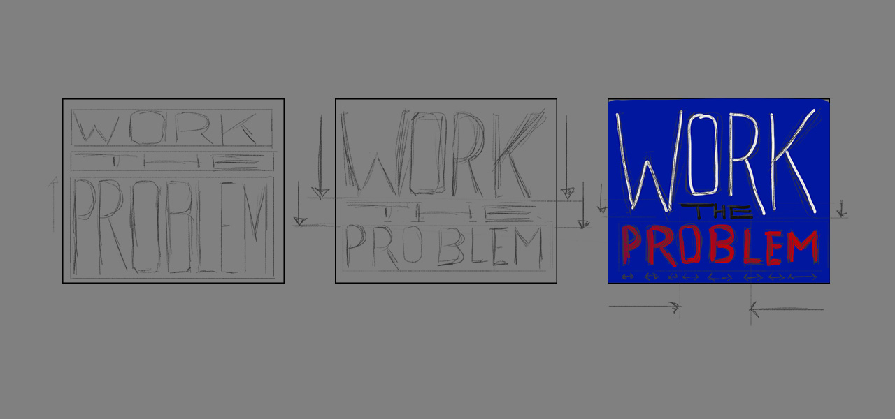
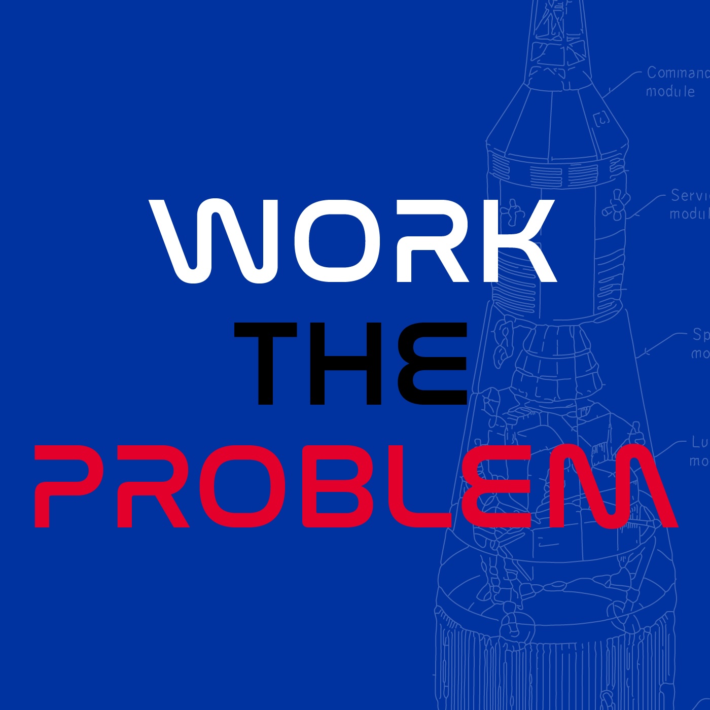
“Work The Problem” kinetic typography
Final project for the Domestika course “Expressive Typography in Motion using After Effects” taught by Mat Voyce. The assignment was to create a kinetic typography animation based on a simple phrase. I selected the NASA slogan “Work the problem,” made famous during the Apollo 13 crisis.
To capture the NASA feel, I used the colours from NASA’s own brand guidelines. I also used the typeface Nasalization, which was created by typographer Ray Larabie as an homage to NASA’s “worm” logo. Finally, I imported blueprints from the Apollo mission (available on the NASA website) for the looping background. In After Effects, I added adjustment layers and effects to reproduce the vintage film reel look, imagining this as an educational film discovered in the NASA archives. For that reason, I also used an aspect ratio of 4:3 like old Super8 film, including the rounded corners from the frames on the actual film stock.


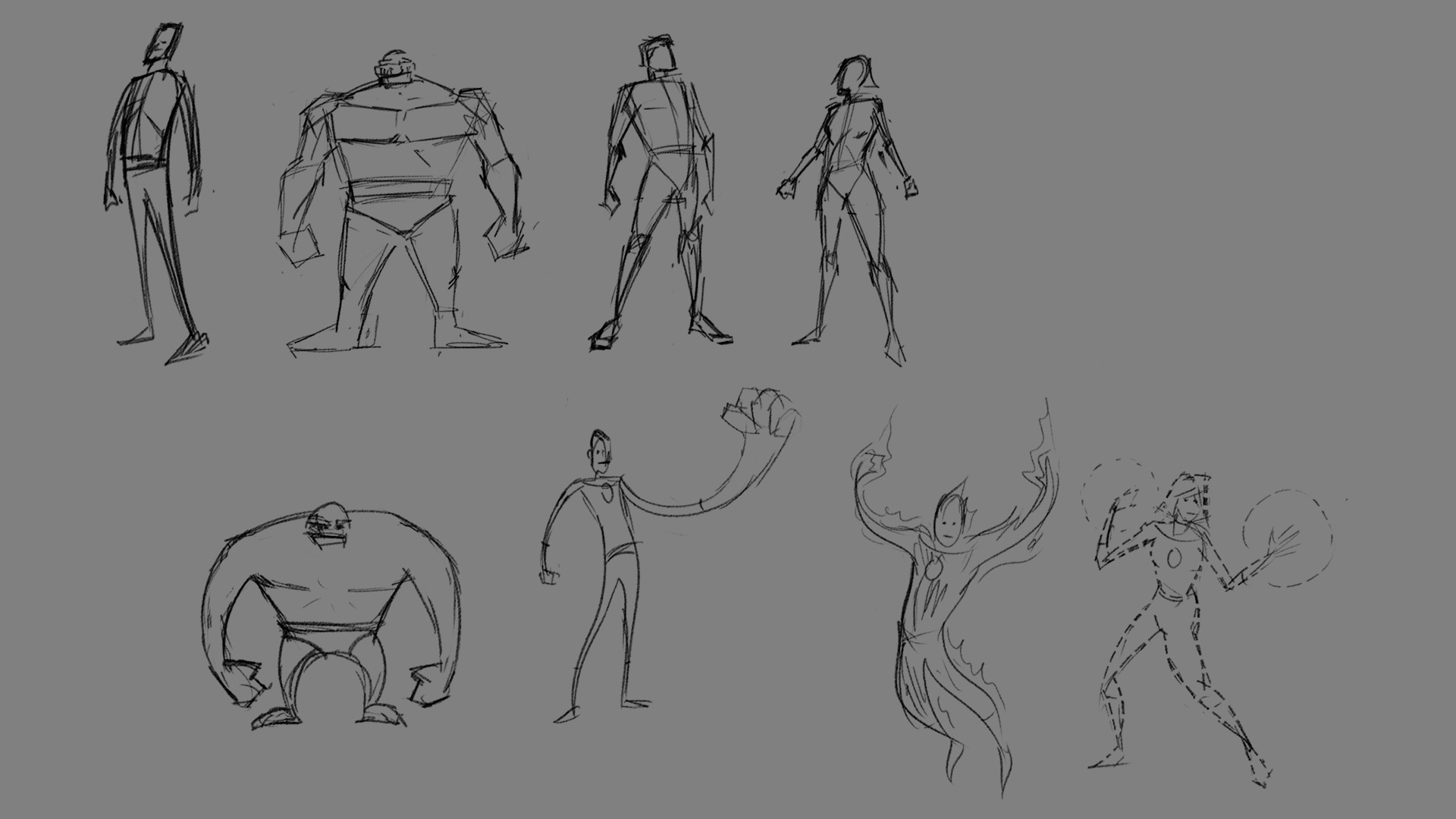
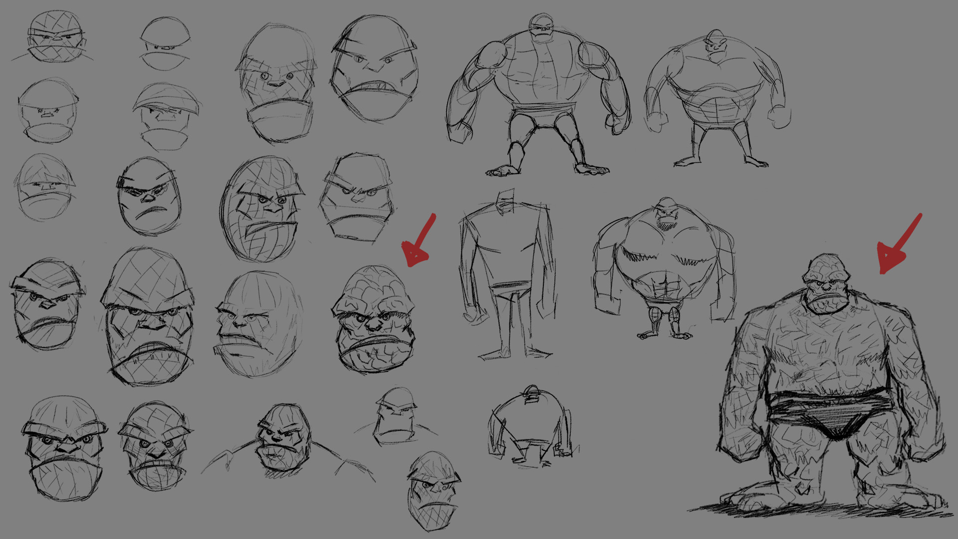
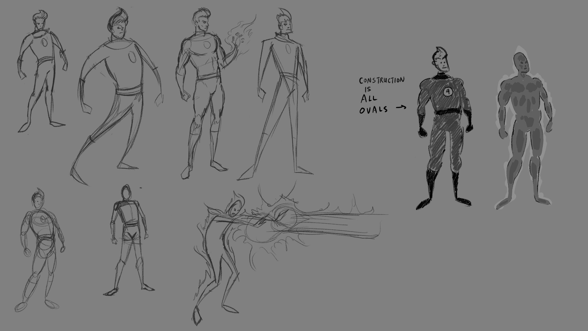
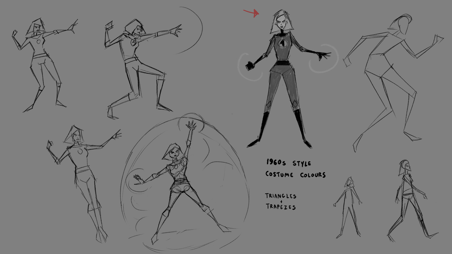
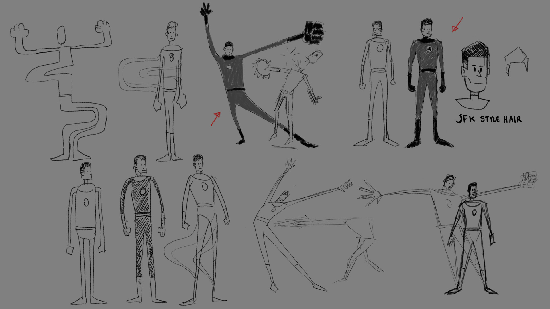
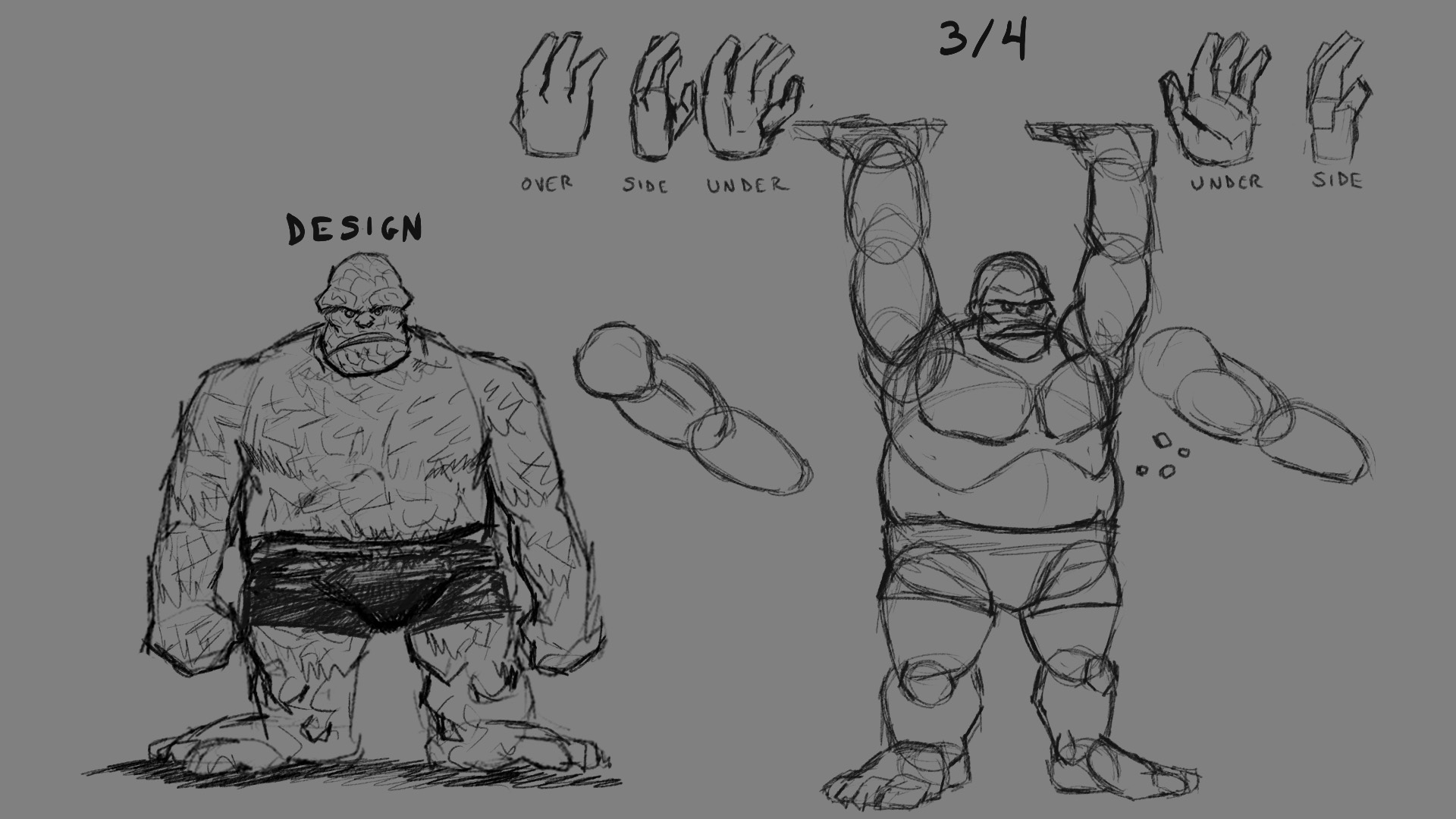
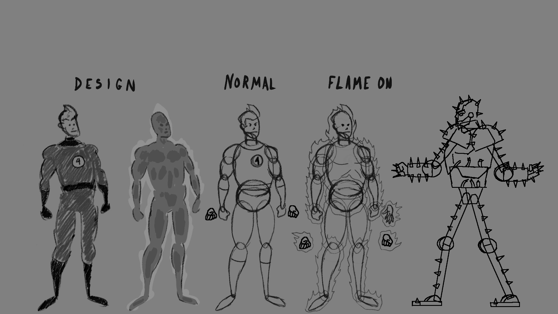
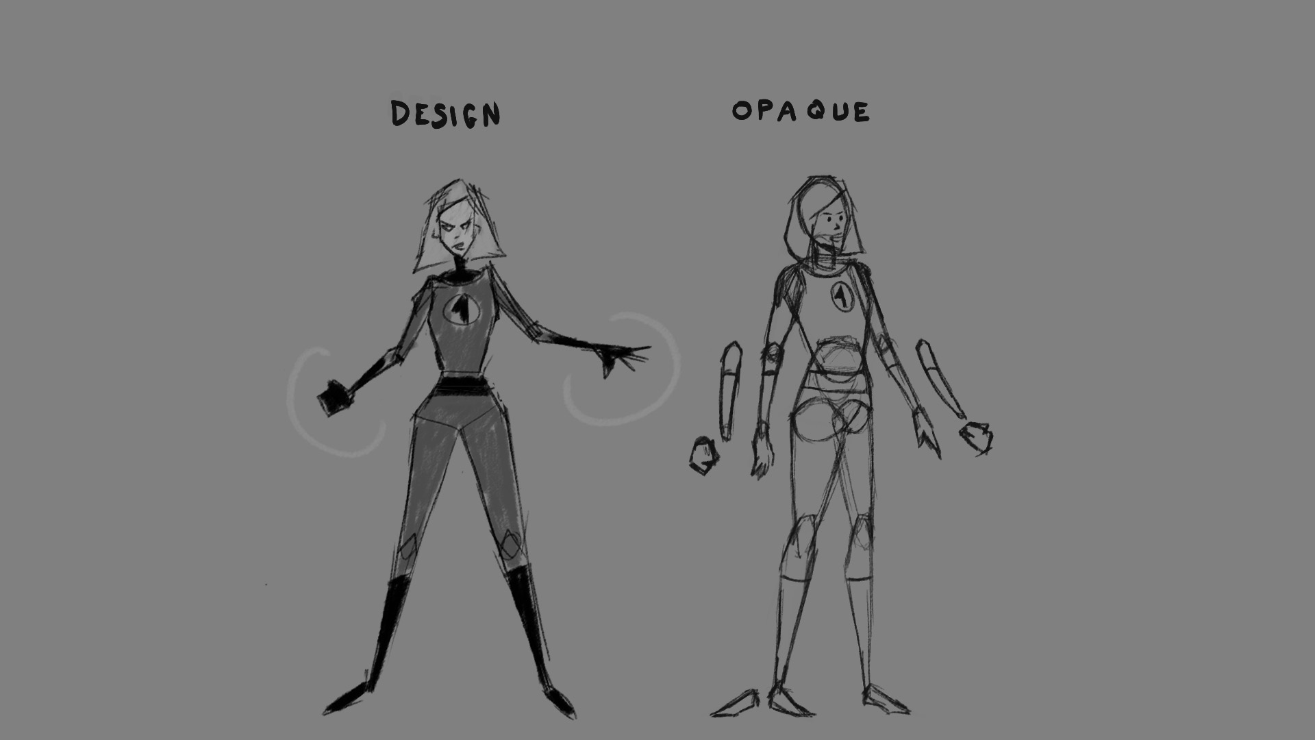
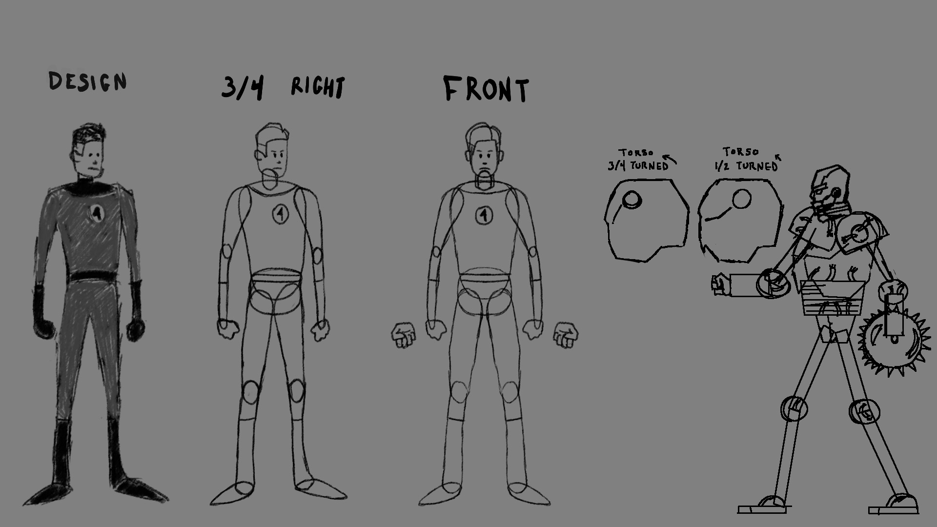
“Fantastic Four” character animations
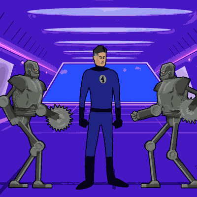
Final project for the Domestika course “Microanimations in 2D in After Effects” taught by Modik Studio. We had to create a series of micro-animations featuring related four characters. The course brief was about circus characters such as a strongman, an acrobat, a contortionist, and so on. But I’d recently read Full Circle by Alex Ross, and also the Jonathan Hickman run of Fantastic Four. Since those four characters resembled the archetypes in the circus theme, I thought they would be a great fit for the project.
I didn’t draw the Fantastic Four much in my teen years, so I had to do some exploration to figure out my interpretation for the characters. I wanted them to be defined by geometric shapes. One of the inspirations were the end credits of the Pixar film The Incredibles, which uses a stylized and angular character style. Some of that inspiration can be seen in the initial design for Invisible Woman, but I didn’t stick too closely to that style, and ended up make the characters a bit softer and less angular. However, I tried to give each character their own shape language and silhouette.