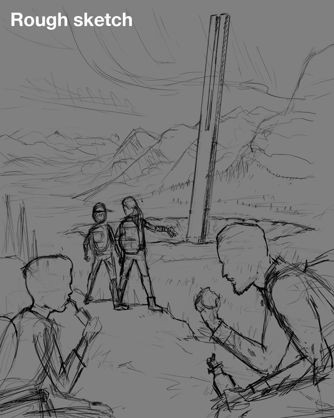
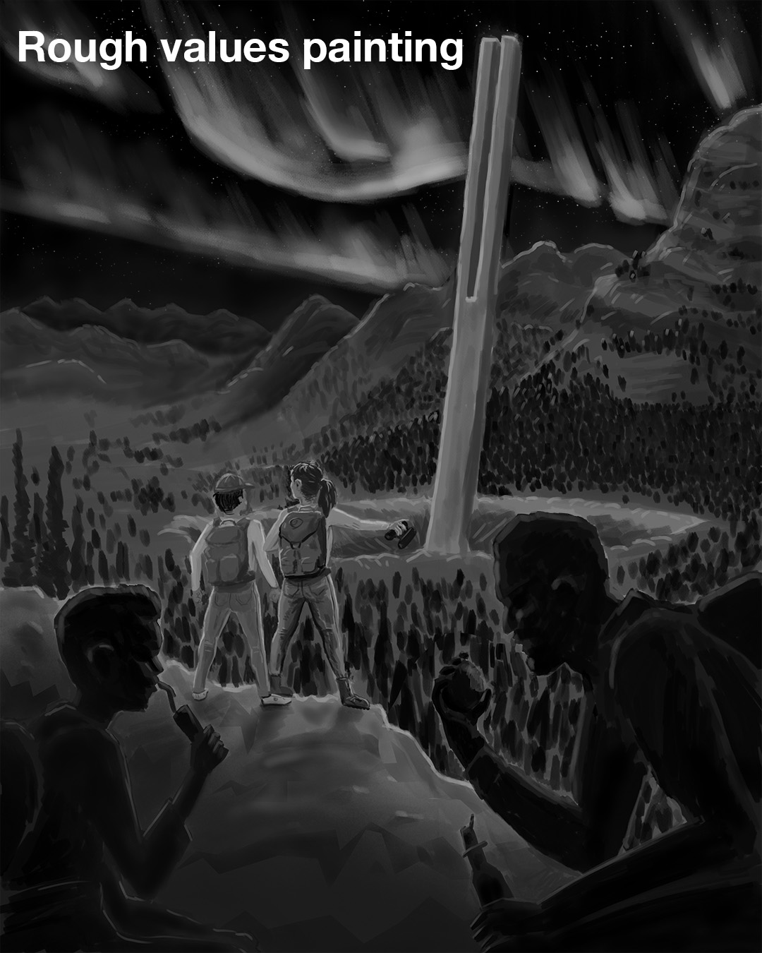
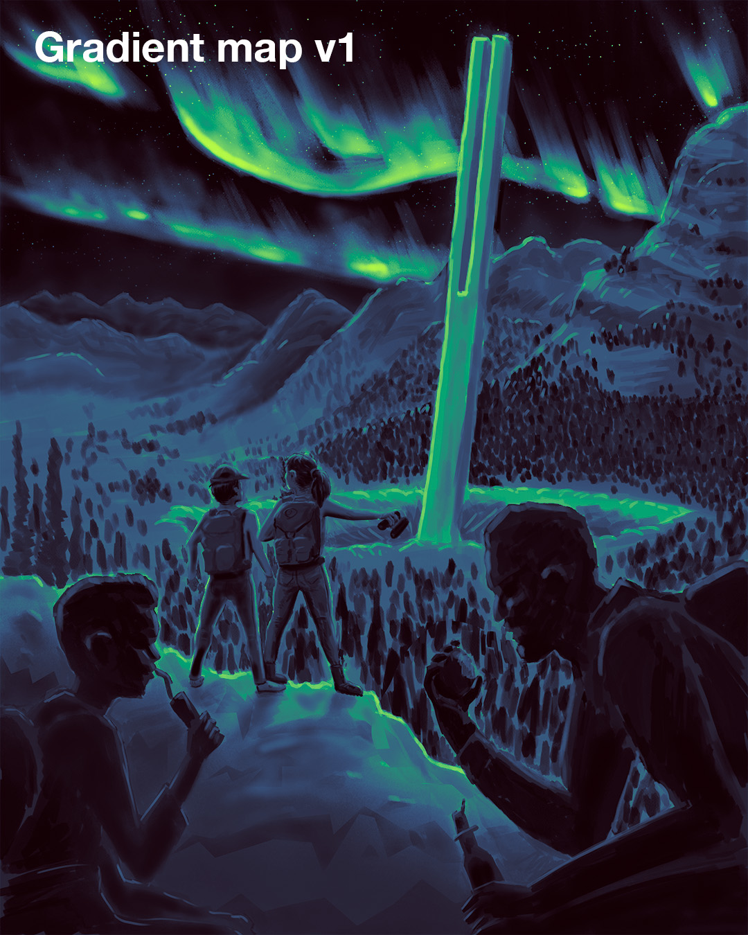
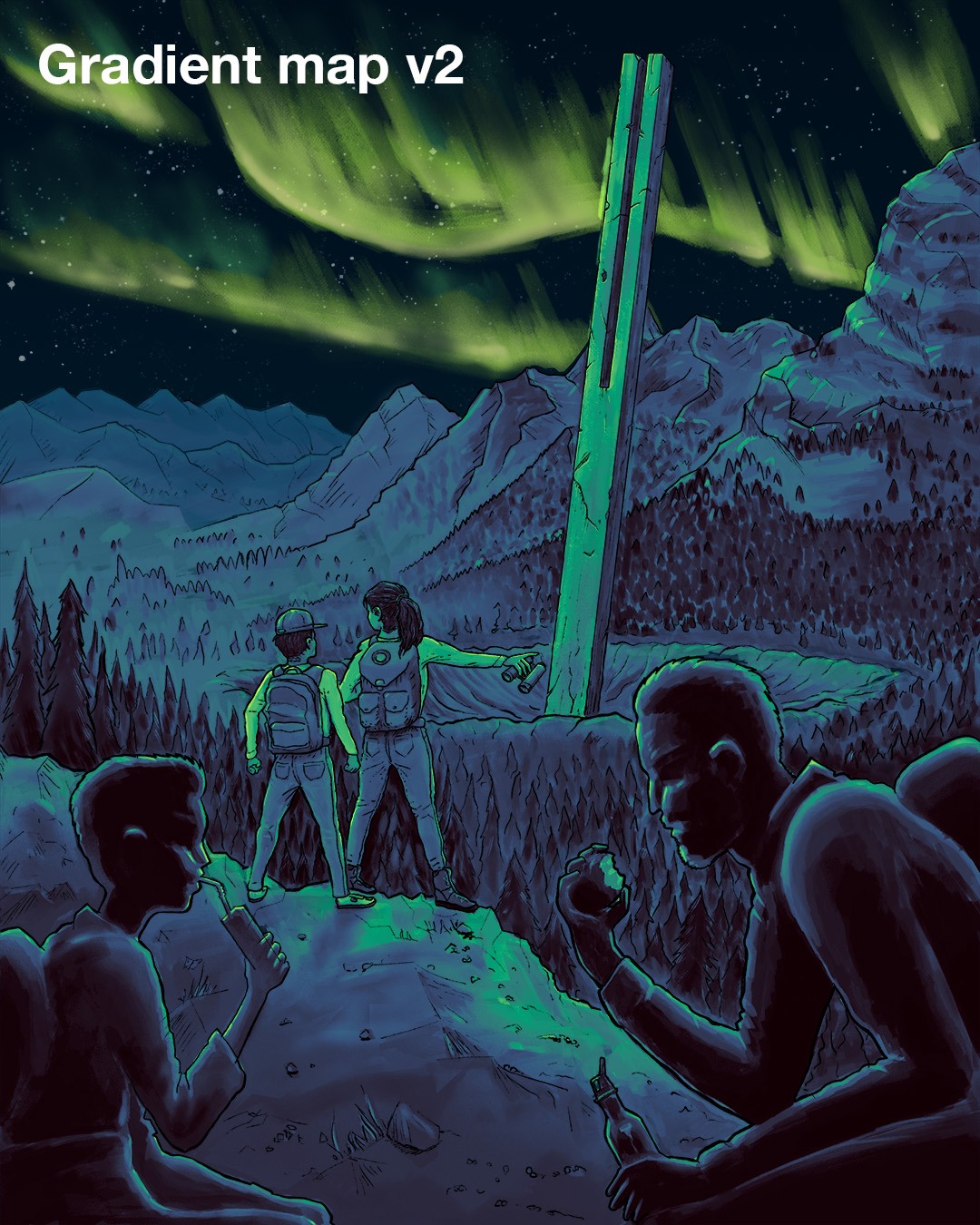
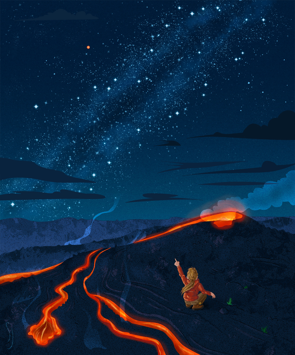
“Discovering The Ruin” editorial illustration

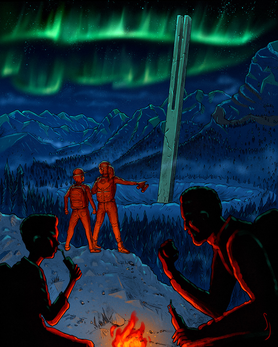
Final project for a Domestika illustration course taught by Deb JJ Lee. We had to portray a scene from a book, preferably one in the public domain. For my inspiration, I chose a scene from the novel I’m writing. Here, the protagonists discover an ancient ruin/monolith while lost in the mountains. It’s the first time I’m illustrating characters from that story, so it’s exciting to see them here.
I experimented using gradient maps, and although the results were interesting, I didn’t feel they gave the composition the right feel, and the emphasis didn’t seem to fall on the characters the way I wanted. I’ll need to practice more with that technique, because Deb’s use of gradient maps was beautiful. Maybe it just didn’t work with my composition or I didn’t have enough experience with it. I’d love to try creating other illustrations from that story, so I may have another opportunity to try the gradient map technique.


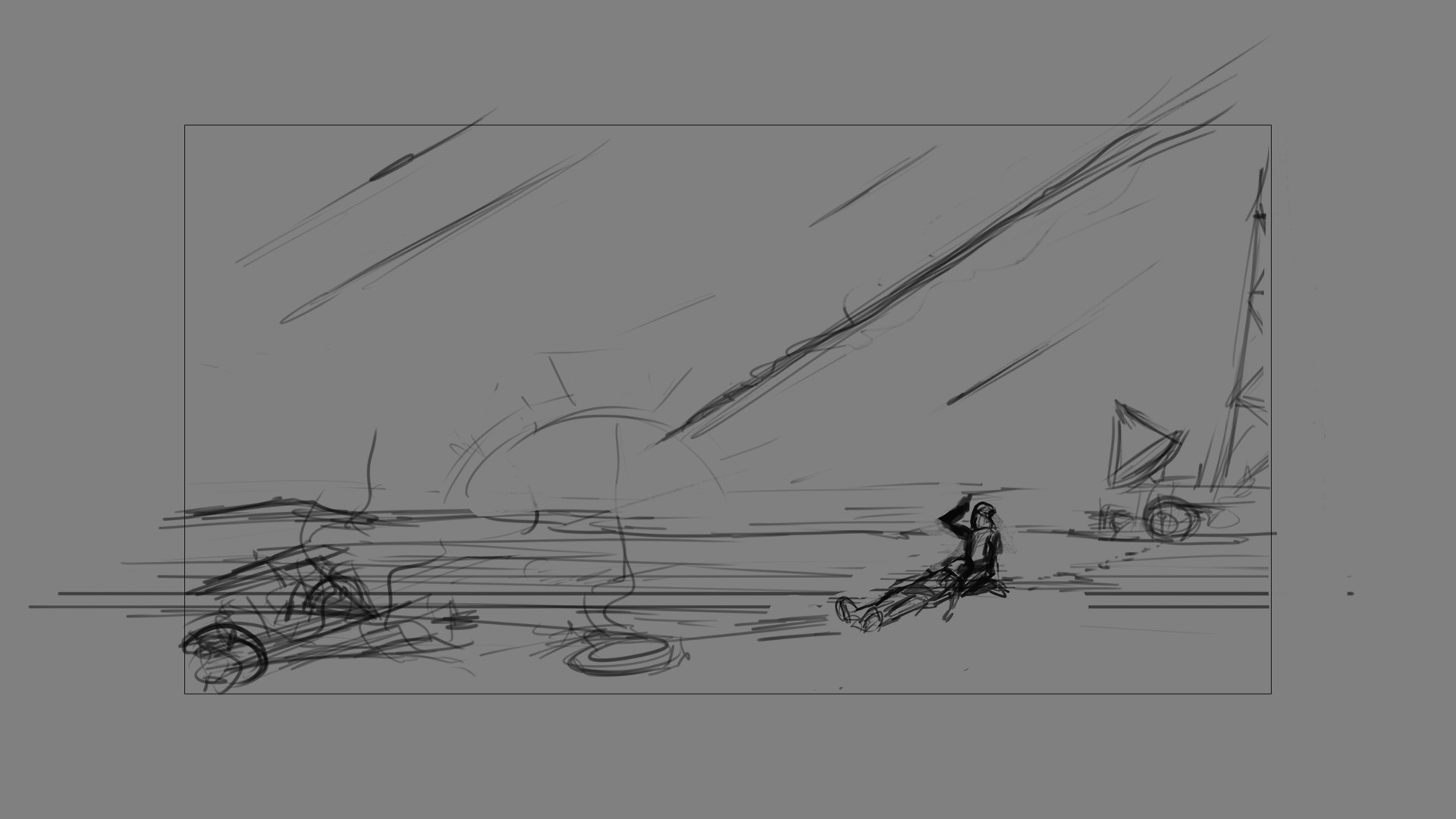
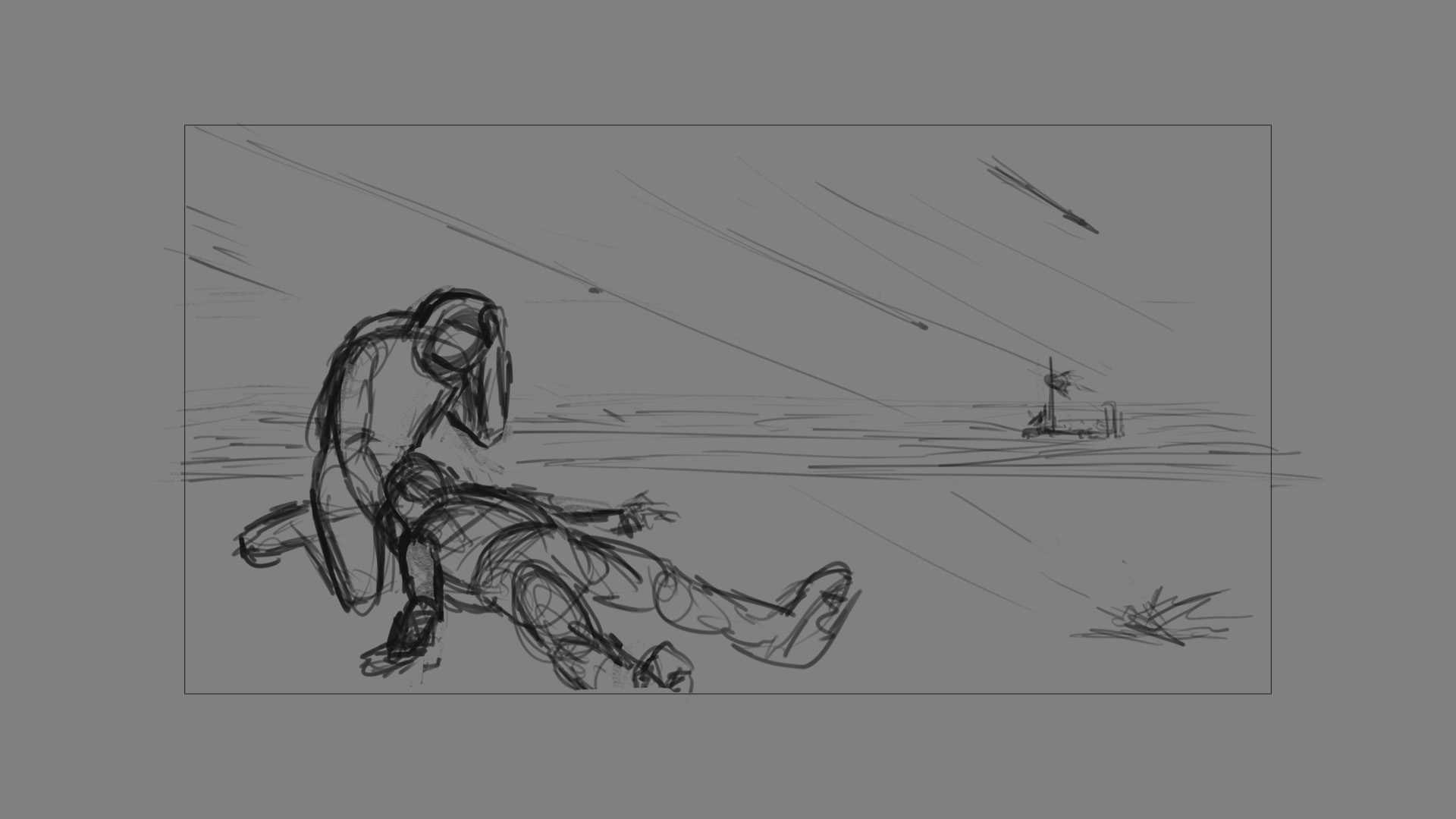
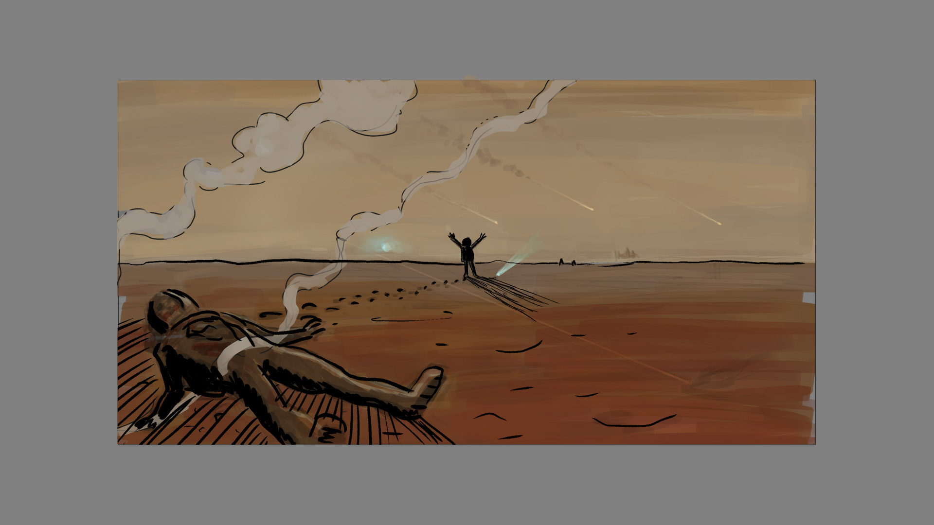
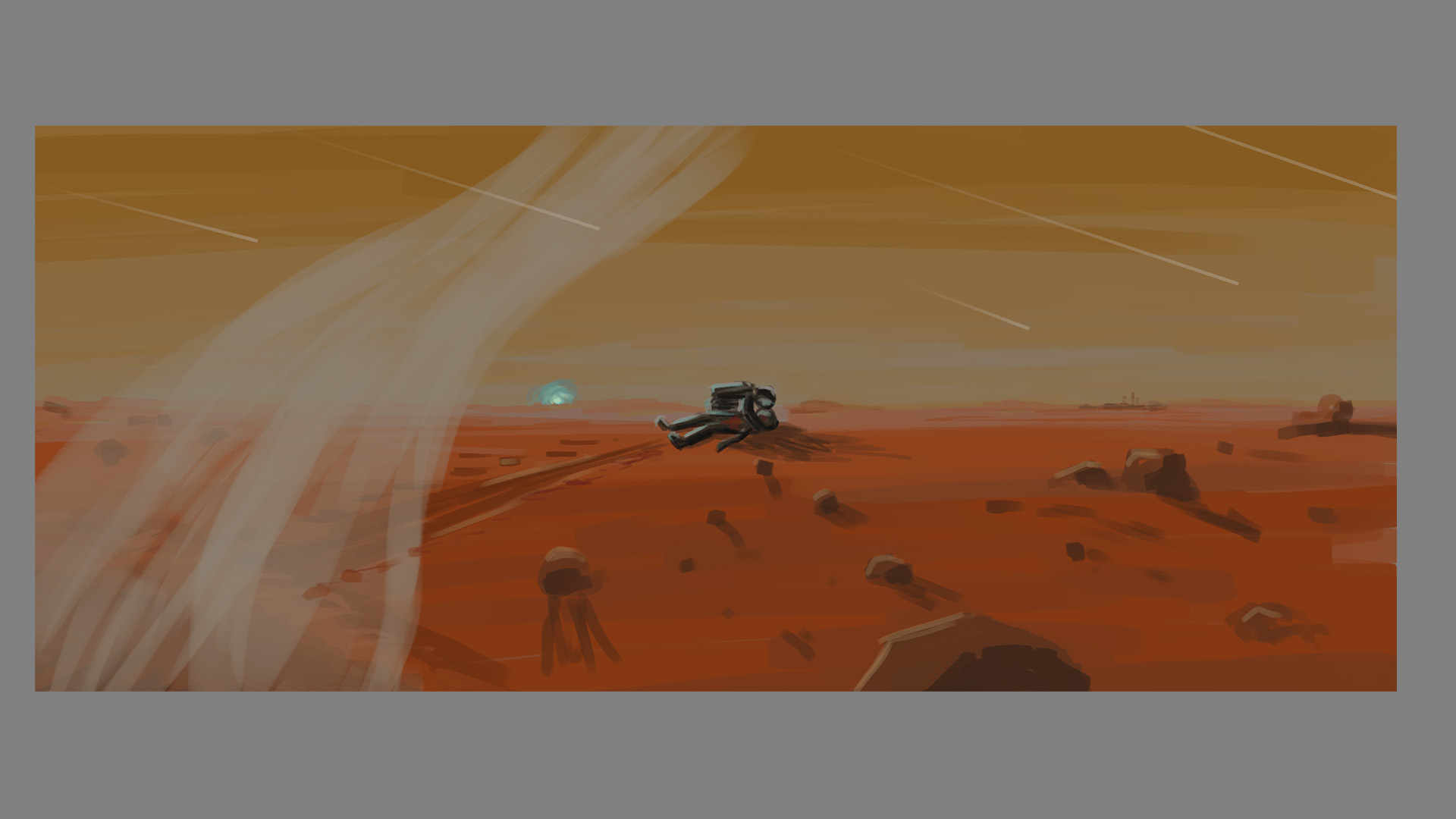
“Life and death on Mars” editorial illustration

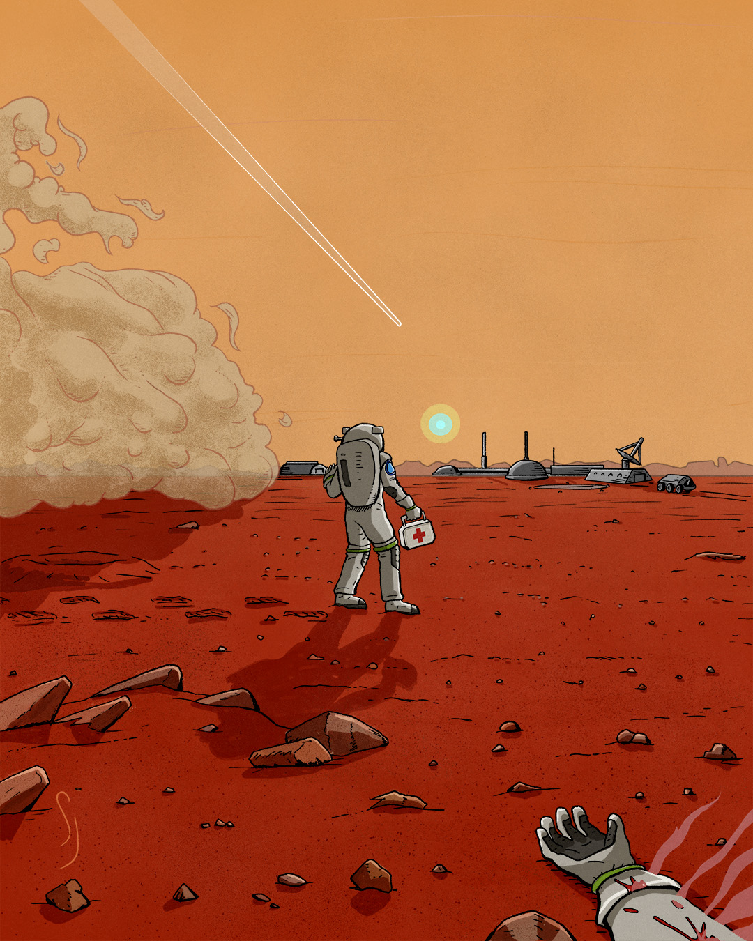
Project for the Domestika course “Visual Storytelling For Compelling Illustrations” taught by R Kikuo Johnson. We had to create an editorial illustration about the theme of a book, article or film. The goal was to capture the conflict within that story, and to portray it in a self-contained narrative illustration. He has a style inspired by comics, which is right up my alley.
I interpreted an old short story of mine about the life and loss on a Martian colony, set in the near future. The illustration here is less a literal portrayal of that story, and more broadly about some dangers of Mars colonization: dust storms, impacts from meteoroids and asteroids, and crushing isolation. Out of frame, an astronaut lies dead after being struck by a micro-meteor that pierced his space suit—causing his spilled blood to boil and evaporate in Mars’ extremely sparse atmosphere. Due to the atmospheric composition, sunrises and sunsets have a bluish tinge there.
Realistically, the colony would be located underground in an ancient lava tube. That would be the only long-term protection from cosmic radiation, for which Mars has no protection; unlike Earth, Mars has no active magnetic field to deflect that radiation. Anyway, for the sake of an “artist’s interpretation” (and more importantly, illustration practice) this works OK.


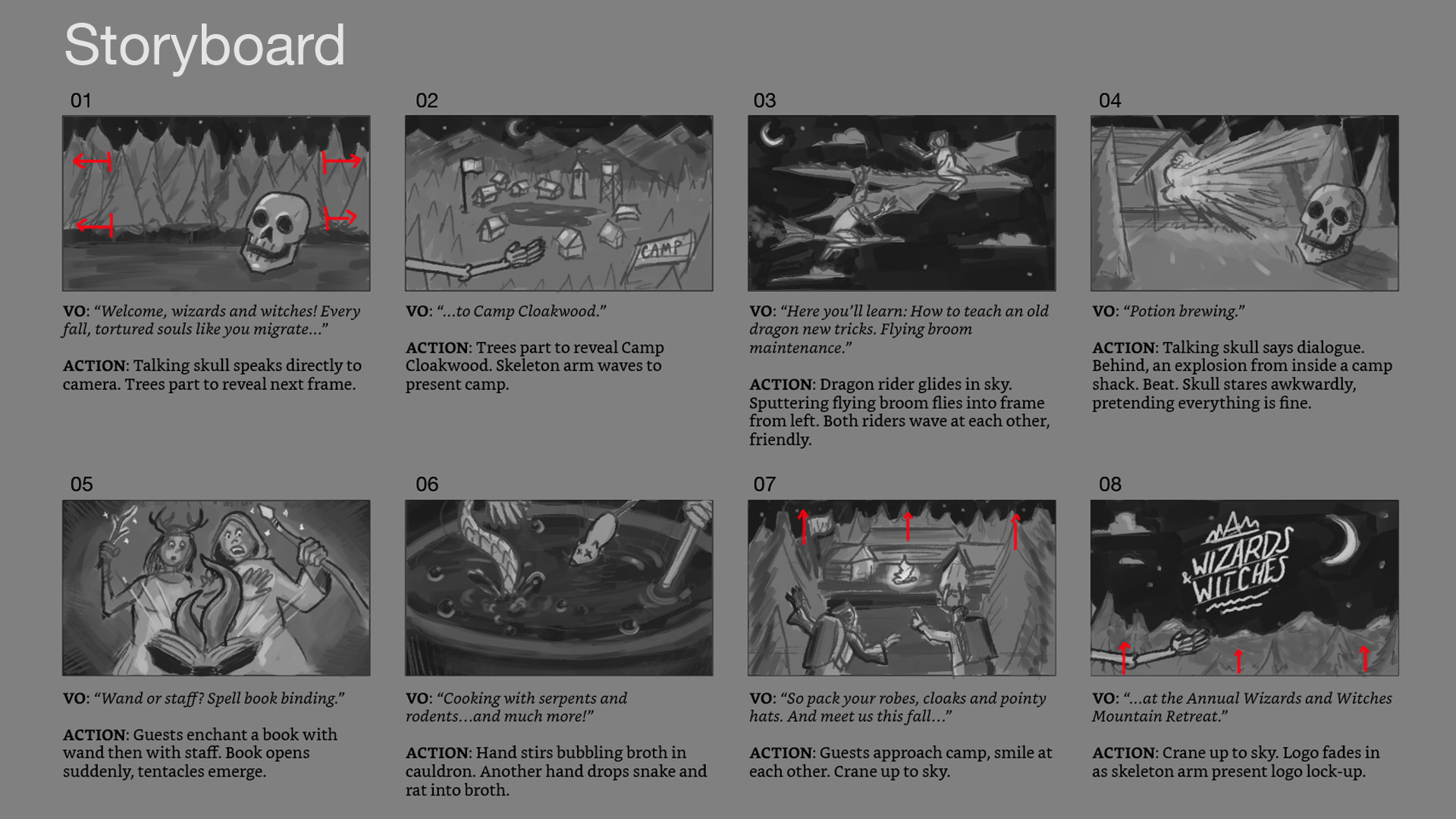
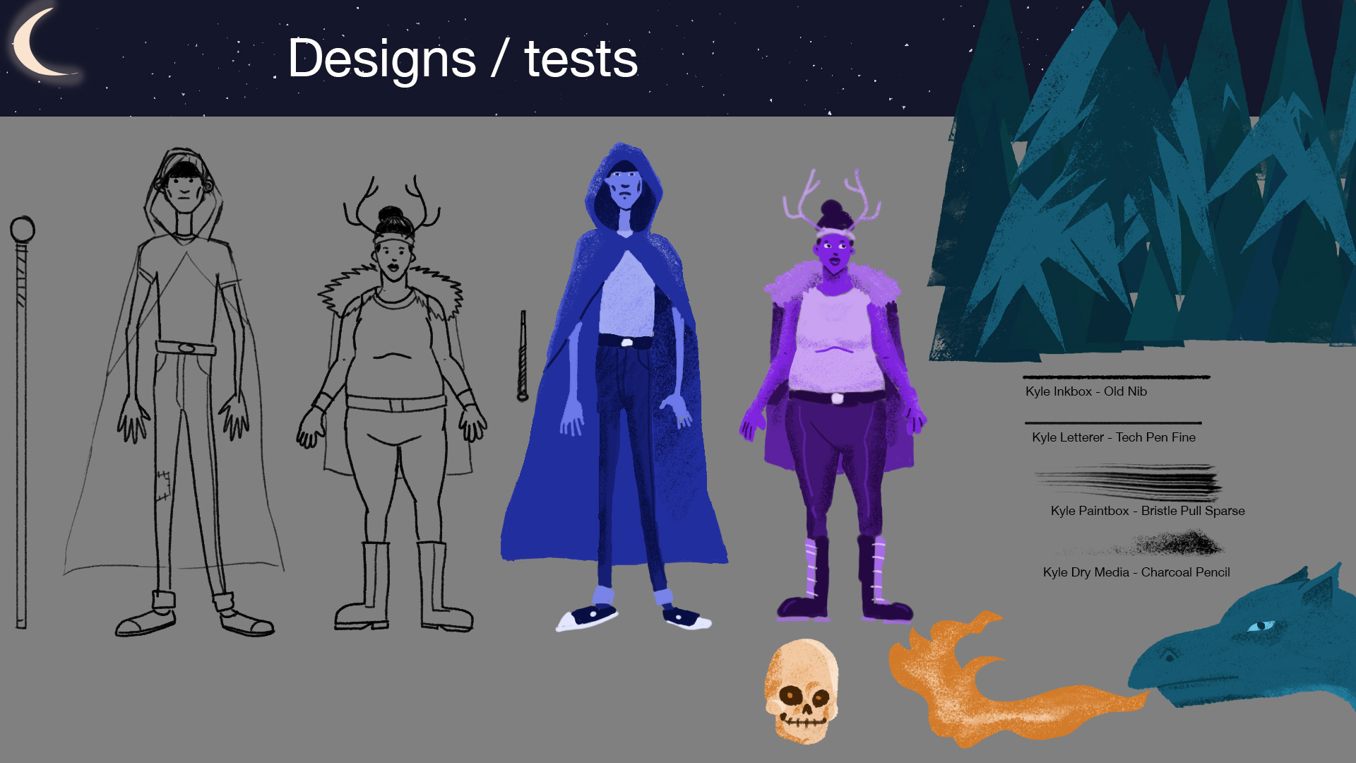
“Wizards and Witches” style frames for animation

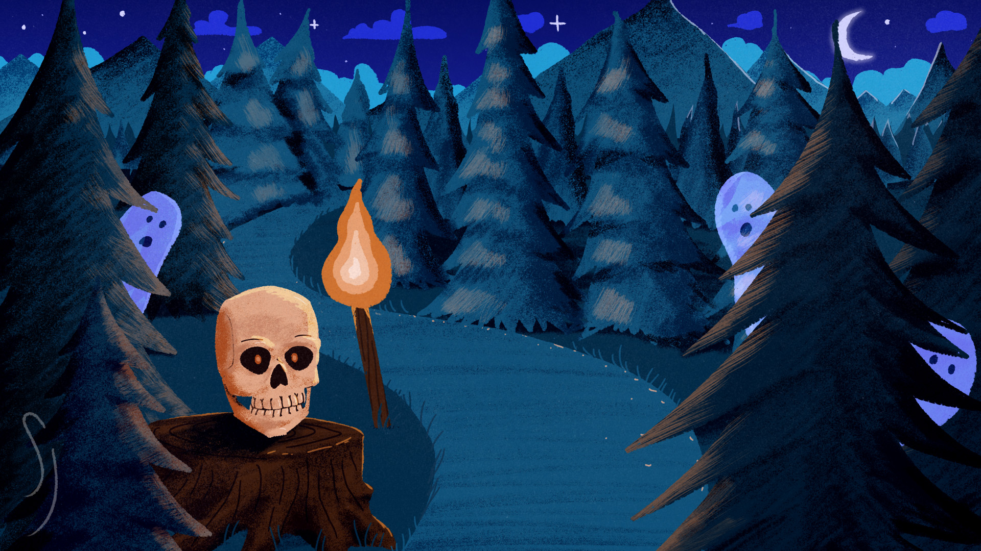

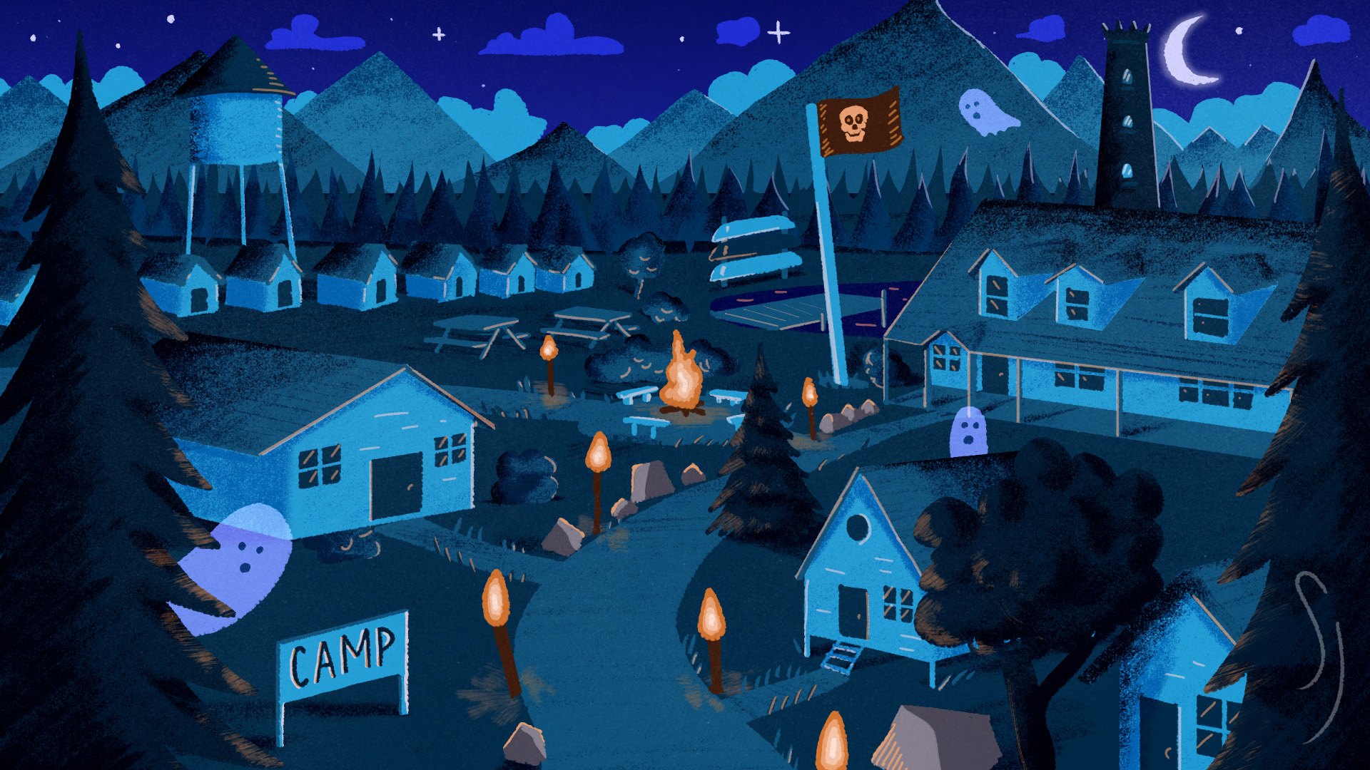

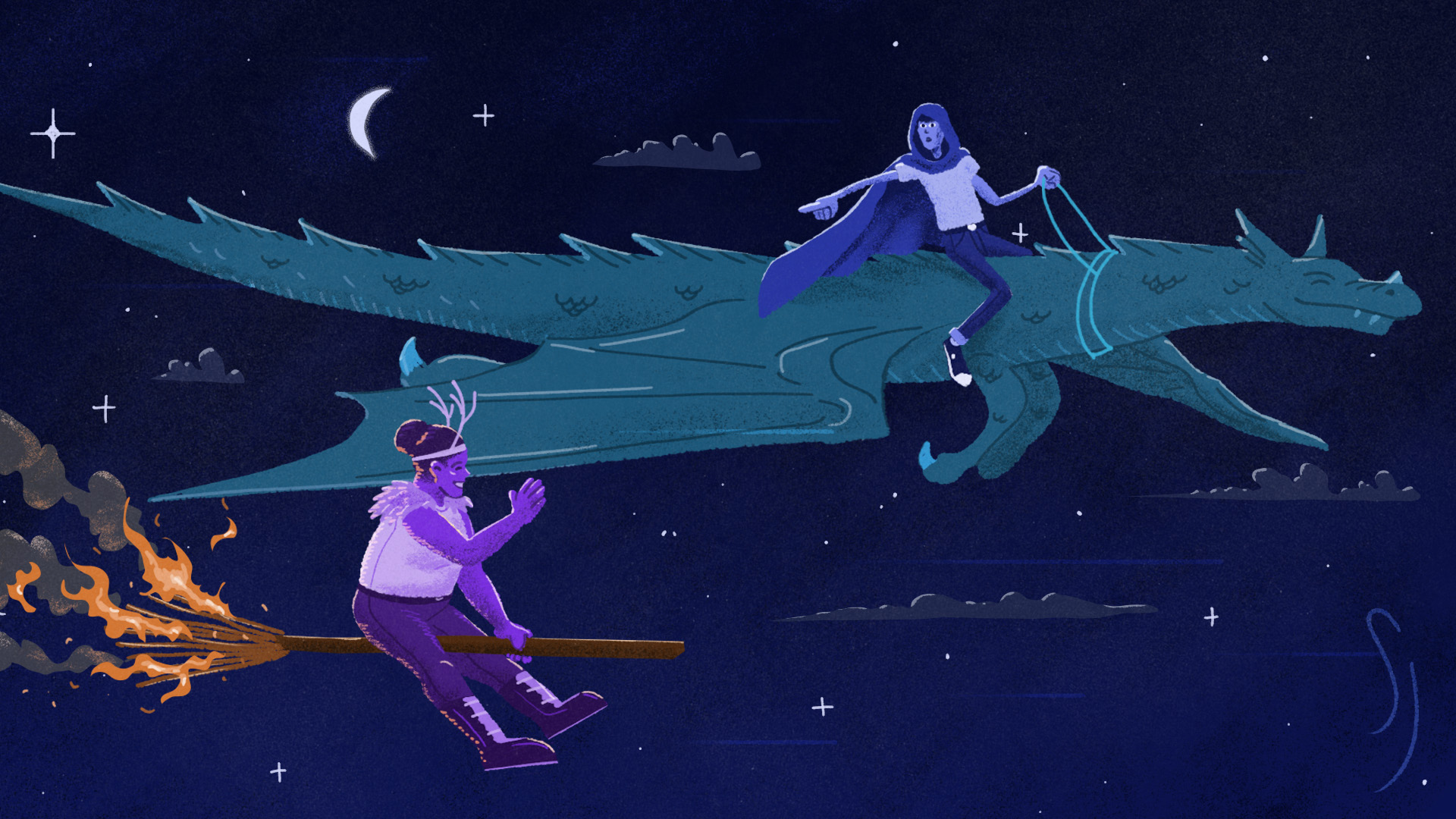

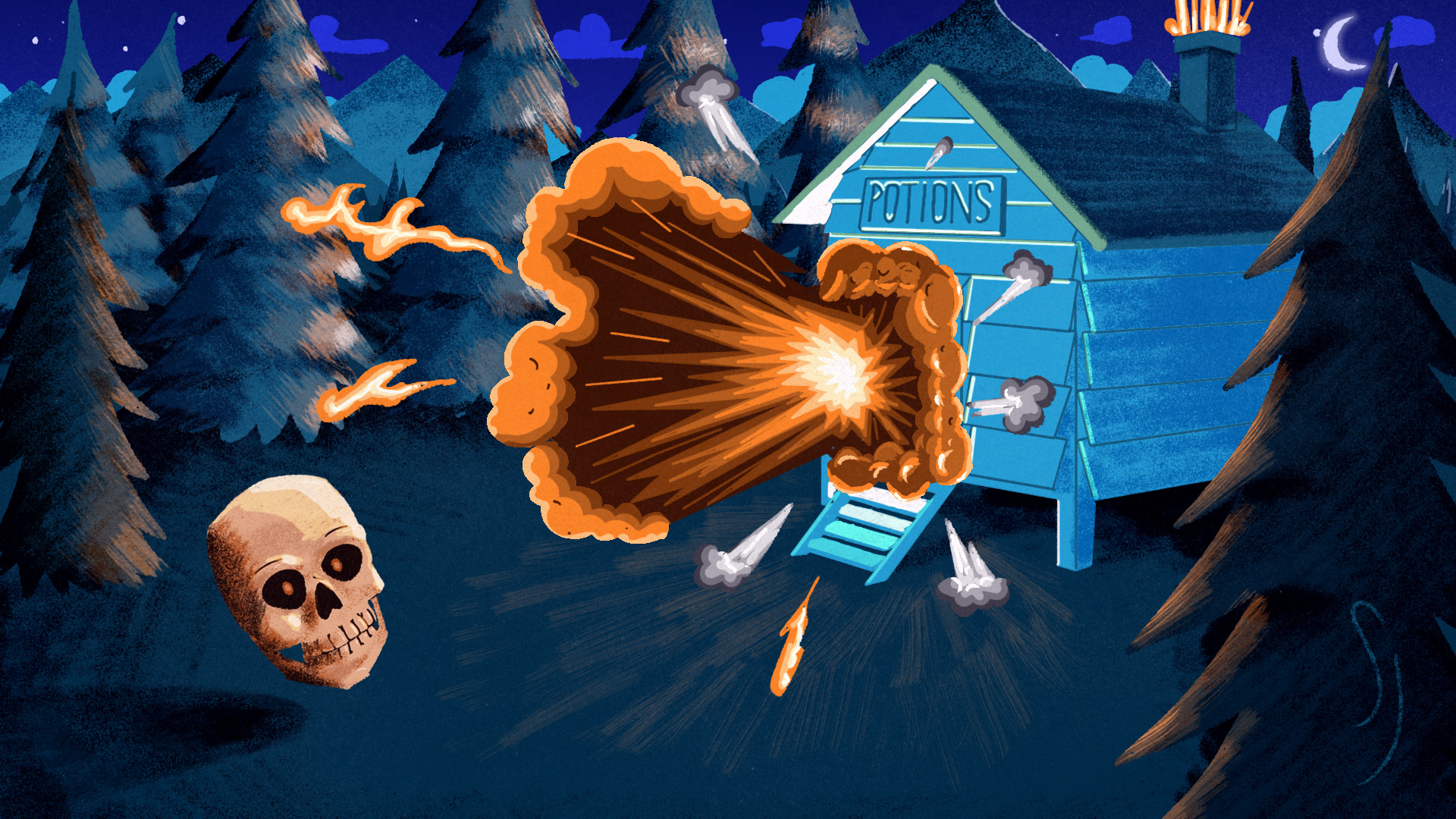

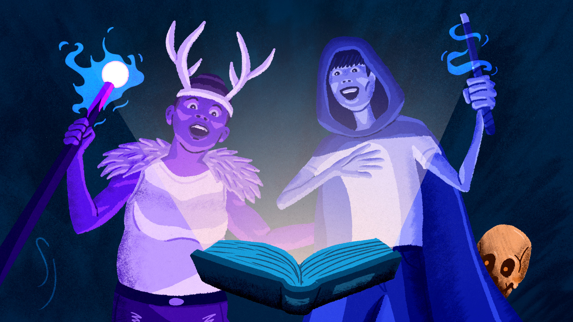


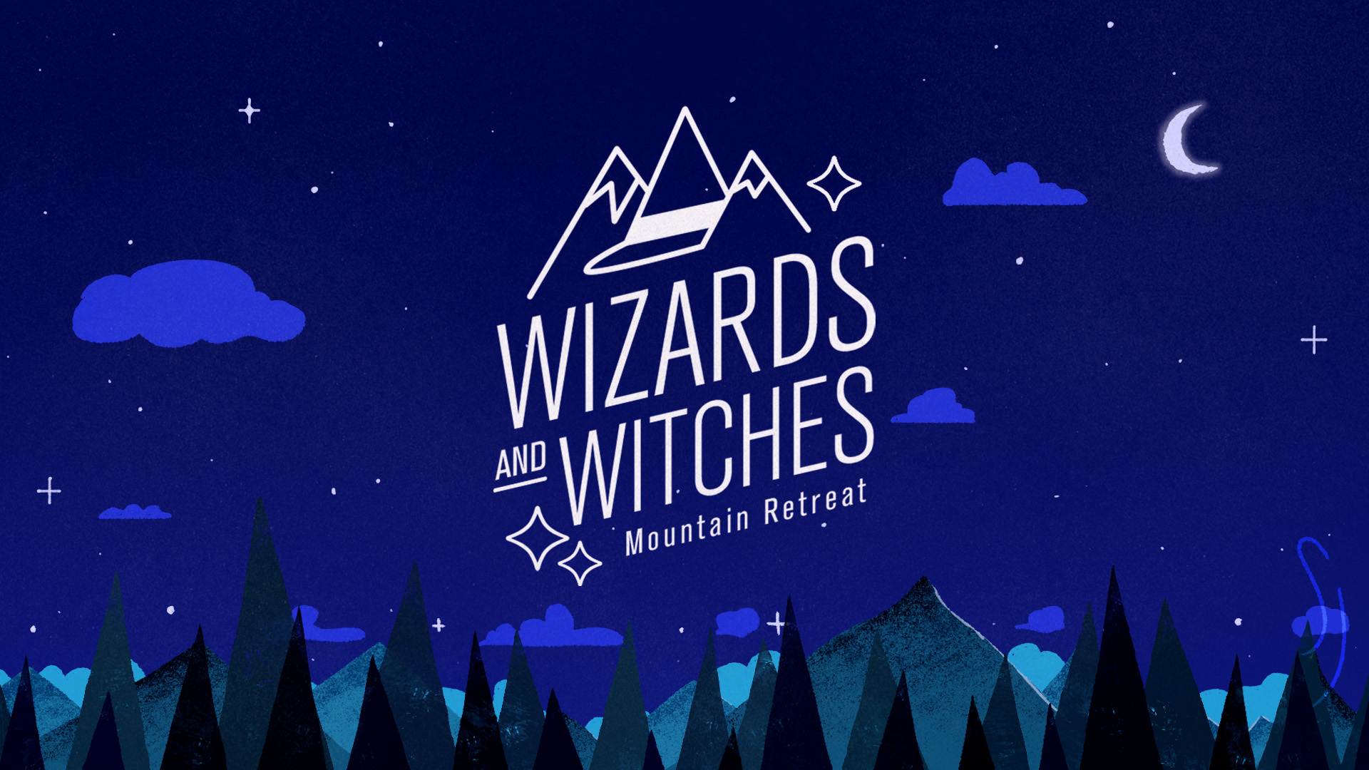

Final project for the School of Motion course “Illustration for Motion” taught by Sarah Beth Morgan and Anne Saint-Louis.
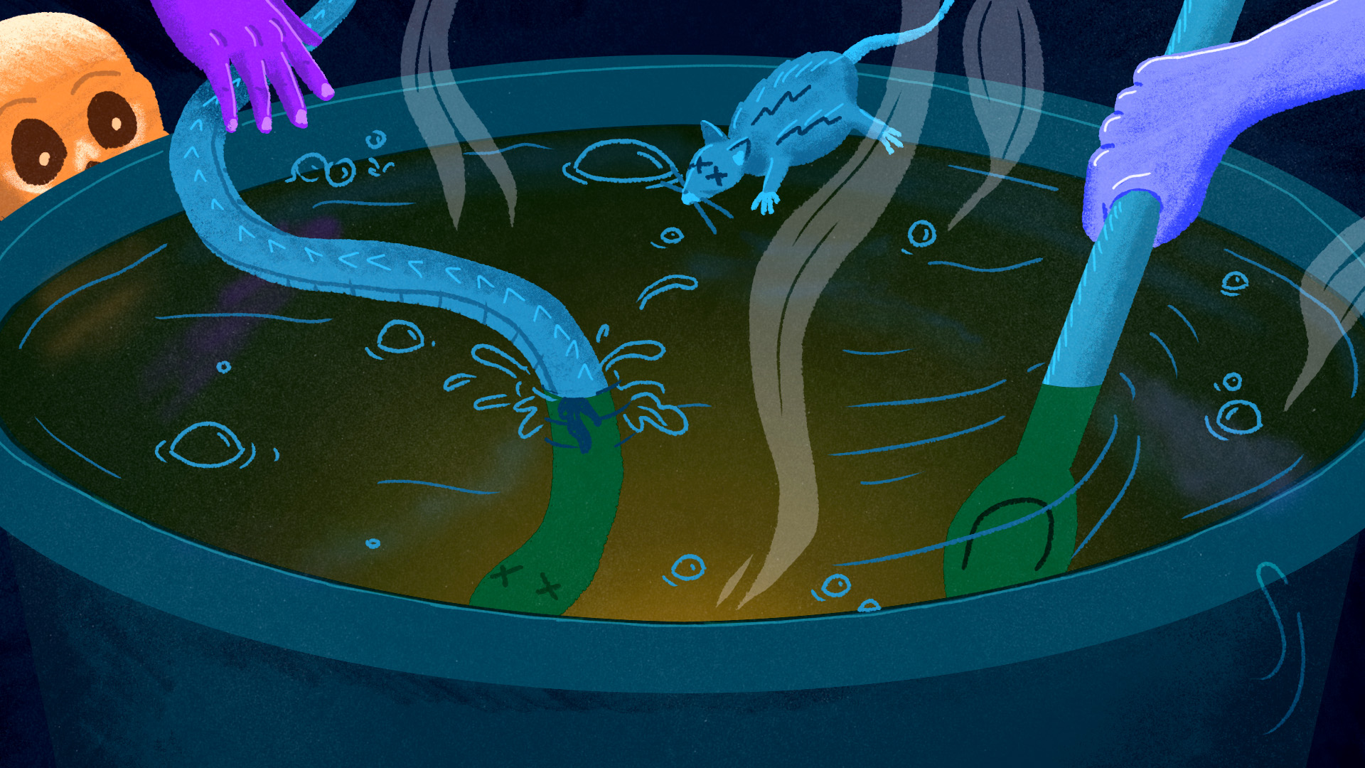
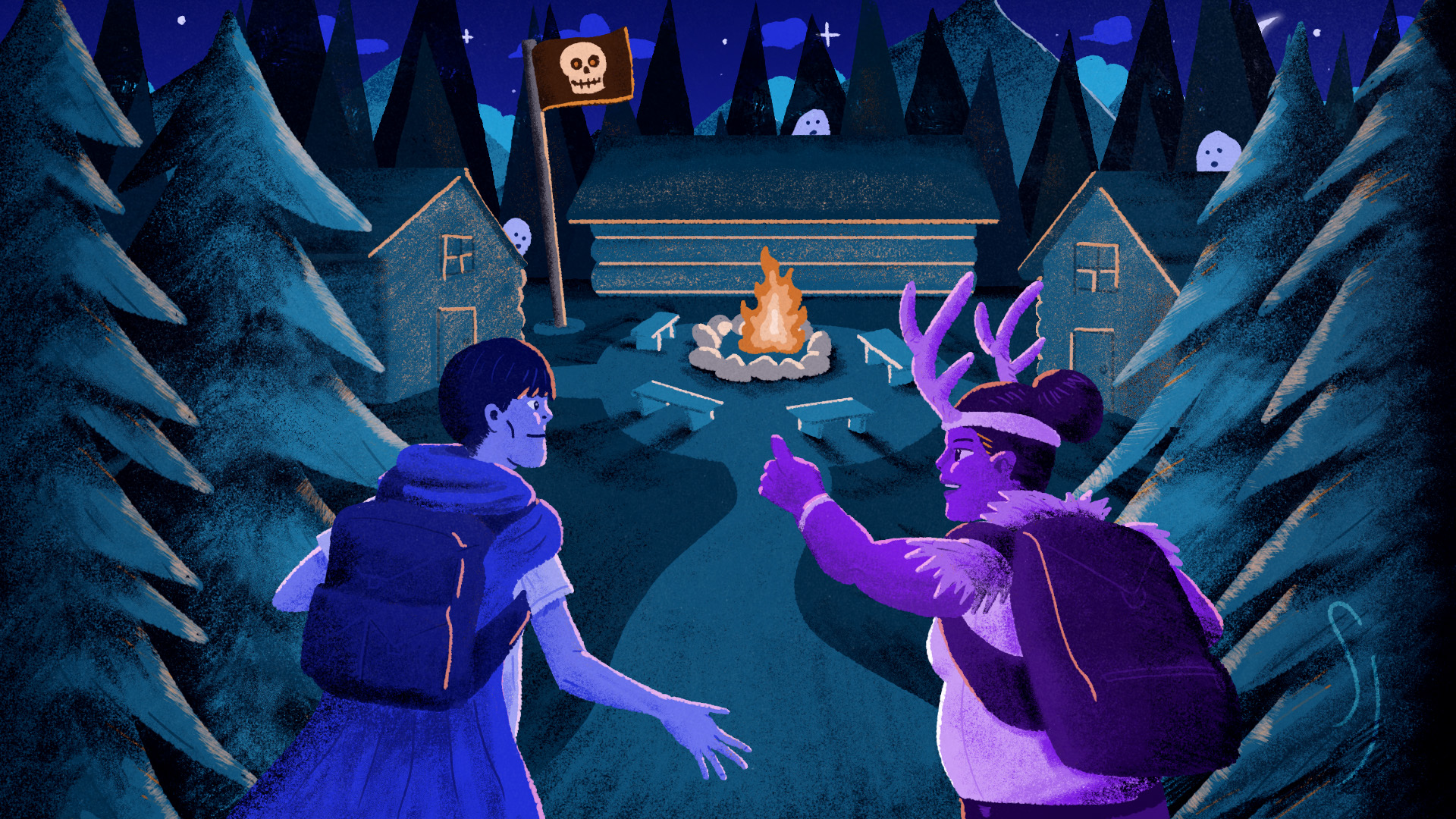
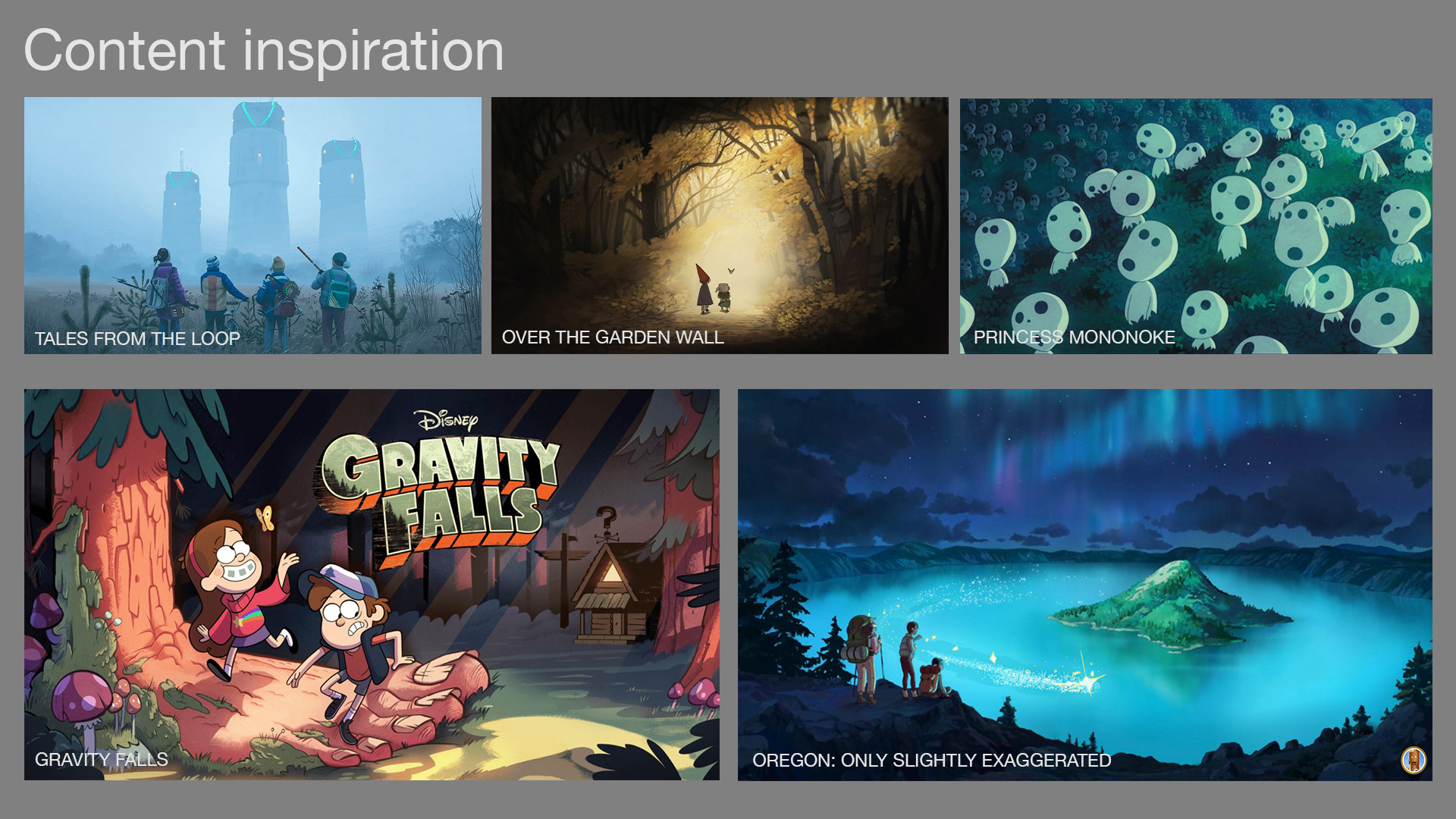
Within the course, we were imagined to be illustrators in a creative agency. A fictional client handed us a brief and script for a 30-second animated advertisement about a magic-themed camp for adults. The camp had a spooky but fun vibe; it was a place where childhood fantasies could come true as campers engaged in activities like wand construction, dragon riding and potion brewing.
We had the freedom to develop our own story concept from that brief, and from there we had to create style frames that brought our concept to life. These style frames would then, in theory, be passed on to an animation team for production.
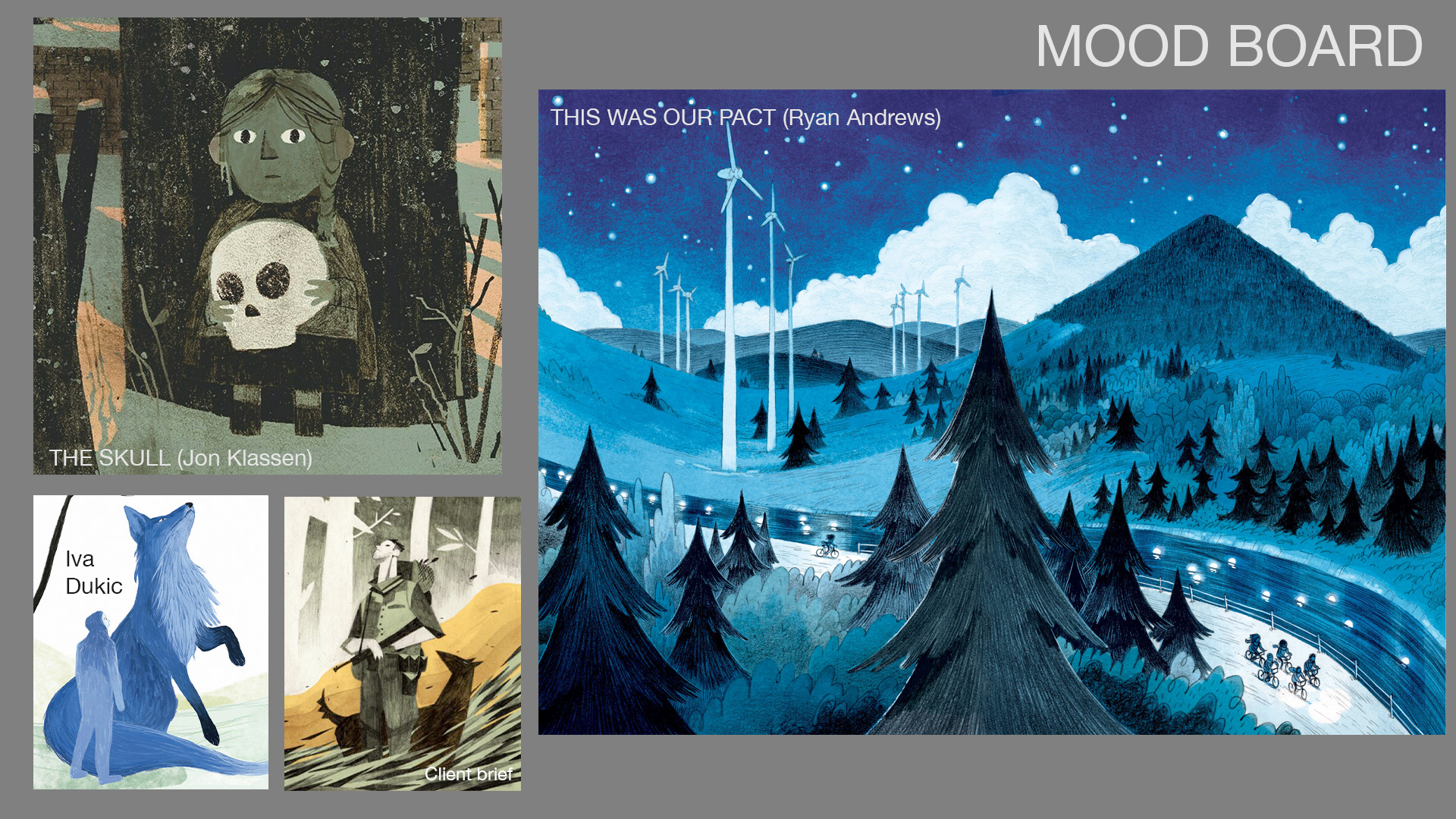
My stylistic inspirations were the Ryan Andrews graphic novel This Was Our Pact, and the picture book The Skull by Jon Klassen. Maybe as a result of the latter, I settled on a chatty skull as the narrator of the spot, who would greet the viewer and narrate the script while the protagonists demonstrated the activities of the camp.
This project was featured on School of Motion’s student showcase blog.


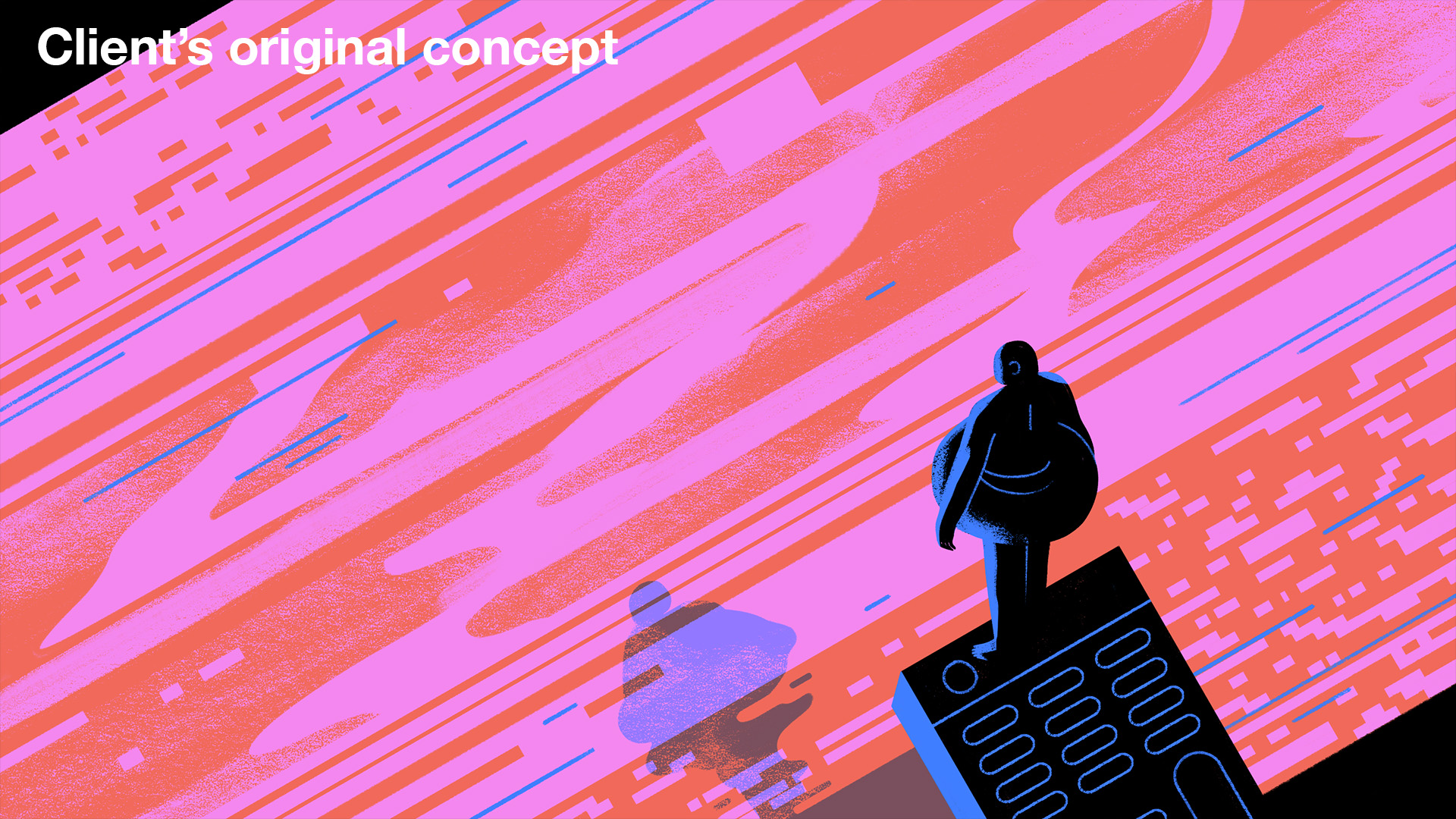
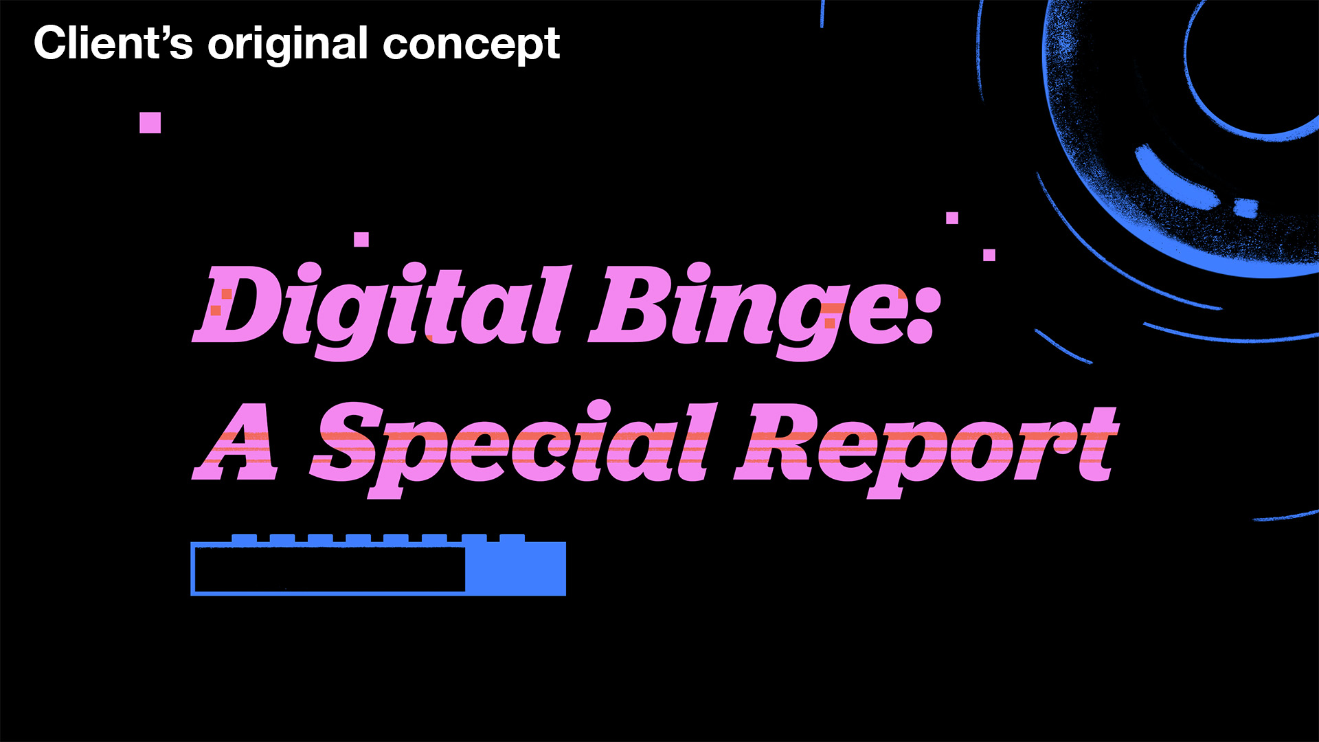
“Digital Binge” editorial illustration

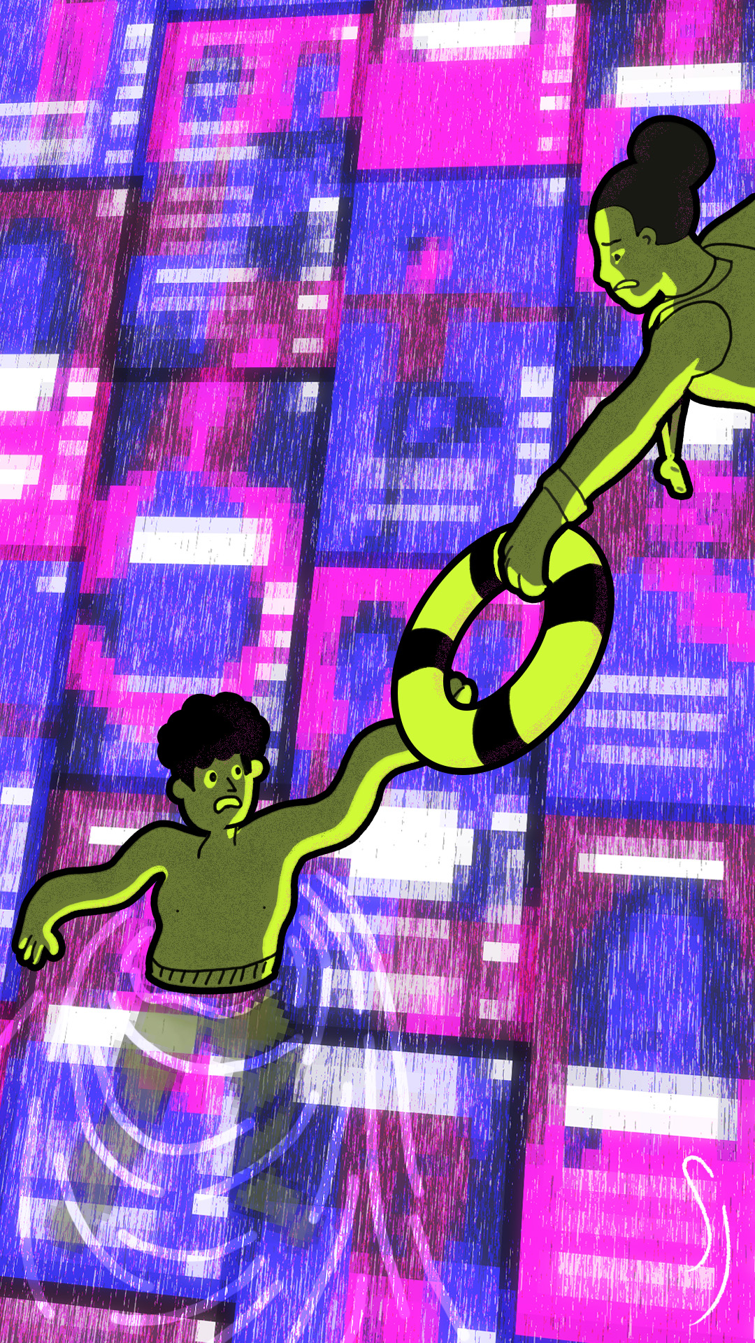

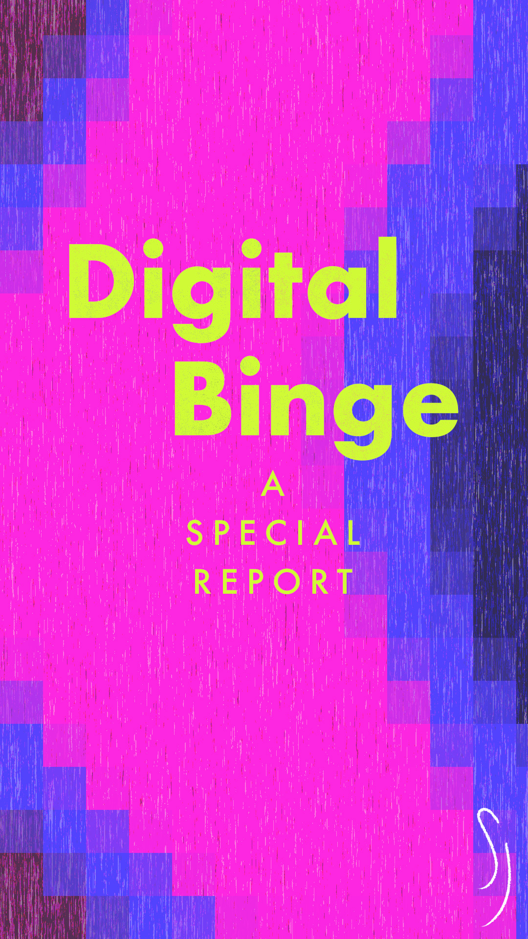

Project for the School of Motion course “Illustration For Motion” taught by Sarah Beth Morgan and Anne Saint-Louis. We were provided a brief by a fictional client, who wanted an editorial illustration accompanying an article about digital consumption habits. They shared their initial illustrations, which reflected a more adult and sombre tone. They wanted new illustrations geared toward a younger audience, which would be viewed on mobile devices. I kept the overall “pool” theme and colour scheme but iterated to add more vibrancy, and added youthful characters in a style that better reflected the target demographic. And rather than reference the remote control from the original illustration—which implied binge-watching on televisions—I wanted to represent what this audience would be more likely to over-consume: short-form viral videos on platforms such as TikTok or Instagram Reels.
This project was feature on the School of Motion student showcase blog.


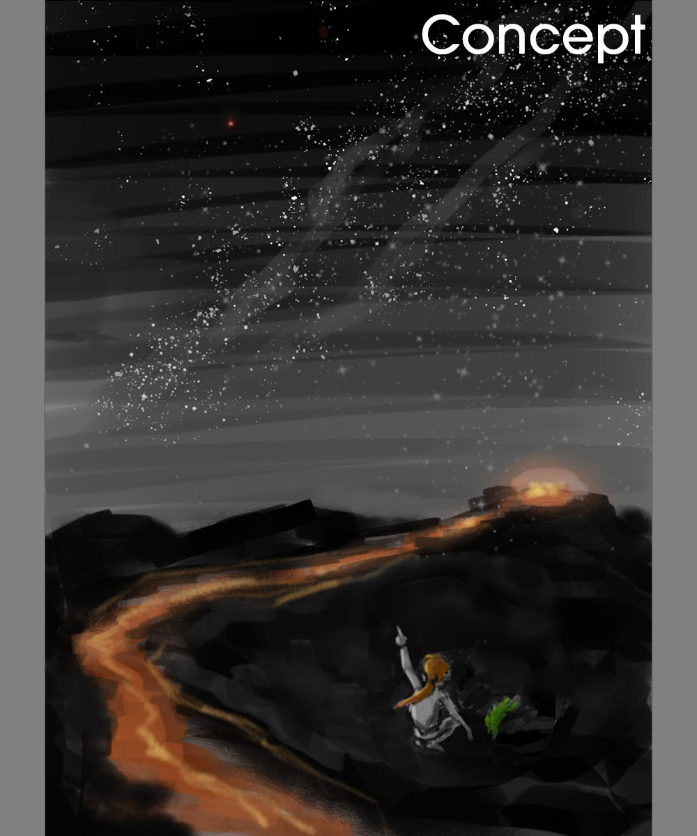
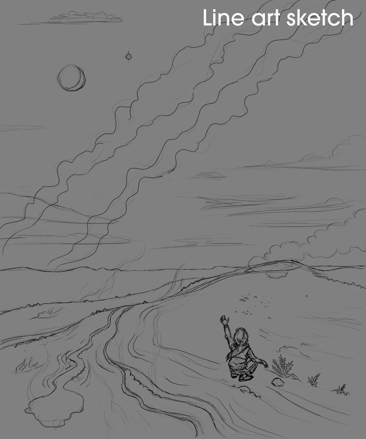
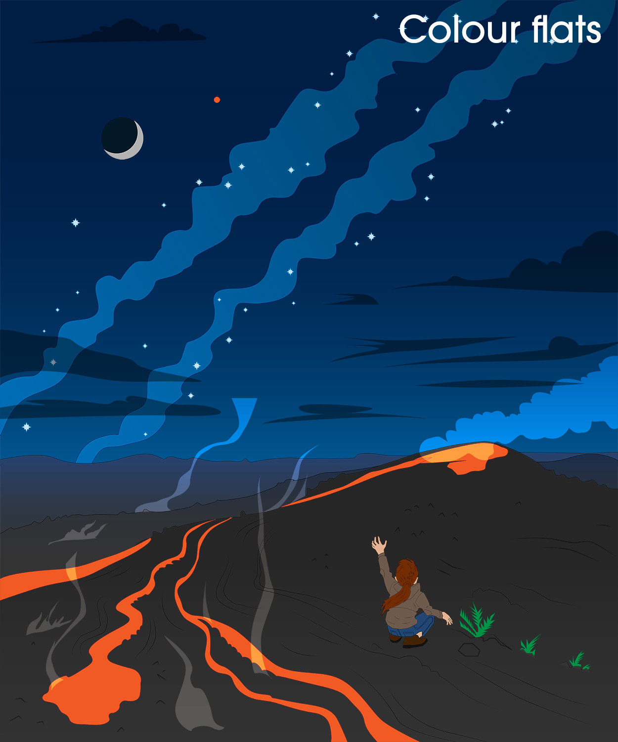
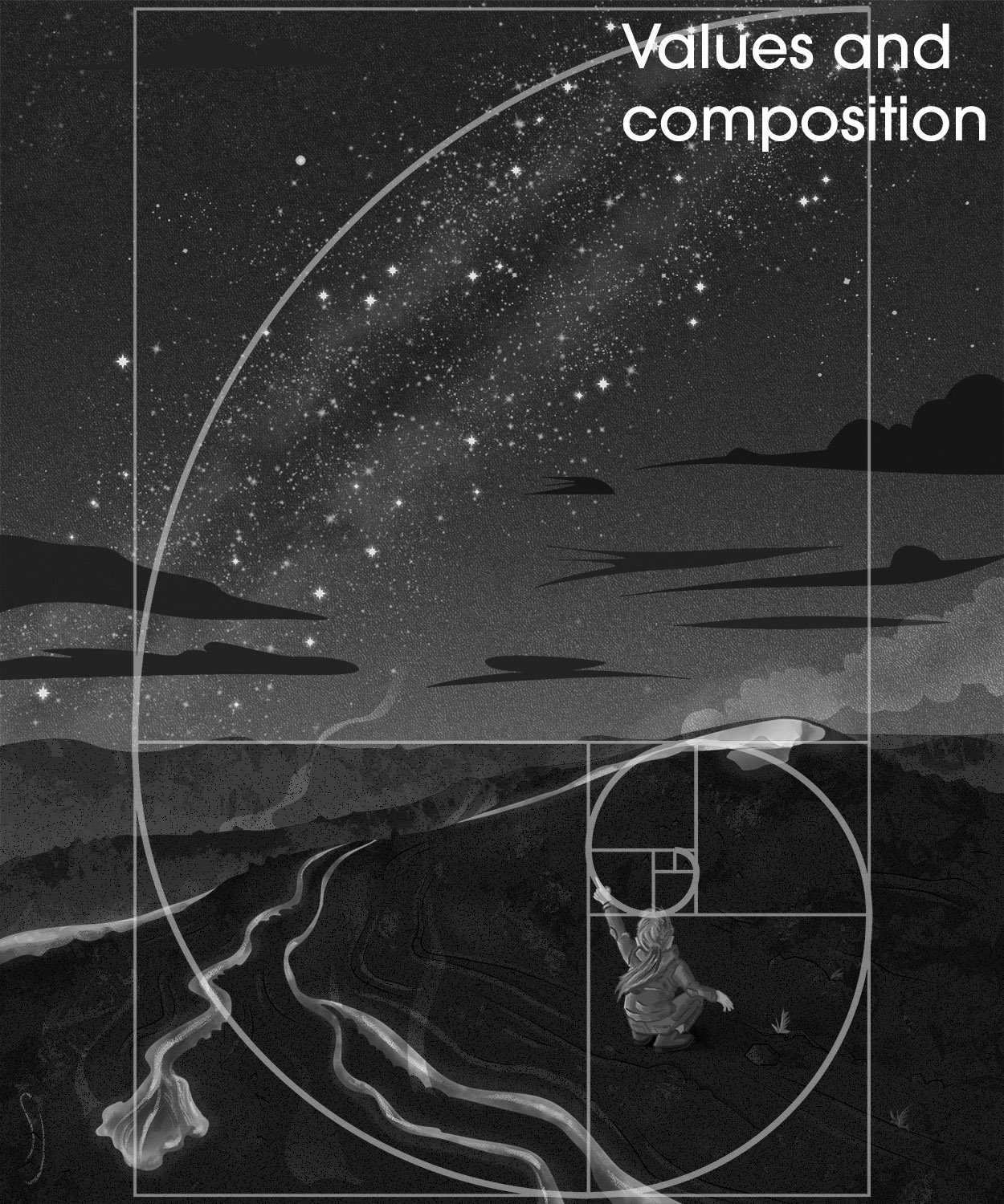
“Sirens of Mars” editorial illustration

Final project for the Domestika course “Composition and Color for Creative Illustration” taught by Marcos Chin. We had to create an image to accompany a previously written text. For my text, I chose a passage from the non-fiction book The Sirens of Mars by Sarah Stewart Johnson, a planetary scientist who searches for life conditions on other planets, including Mars. In the book, she recalls a pivotal moment from her youth: a visit to Hawaii when she found a small fern sprouting in a lava field. The discovery of life in such an inhospitable place inspired her to look for life in the depths of space.
While my illustration isn’t 100% factual to what actually happened, it hopefully captures the drama of the moment and the spirit of her writing. There’s definitely a bit of Le Petit Prince mixed in my piece.
Here is the text from The Sirens of Mars, published in 2021 by Penguin Random House:
One day, when everyone was having lunch, I wandered over to check out the view from a distant ridge, where the solid lava gave way to pyroclasts and tephra. Without really noticing, I was kicking at the rocks as I stepped. I overturned a surprisingly large one with the toe of my boot, and as my eyes fell to my feet, I startled. Beneath the vaulted side of that adamantine black rock, a tiny fern grew, its defiant green tendrils trembling in the air.
There in the midst of all that shattered silence was a tiny splash of life. I crouched down to see it better.
[…]
It was just so impossibly triumphant. I couldn’t pull myself away; I looked at it for so long that the others had to come find me. I showed it to them, but I didn’t have the words to explain its beauty, its significance. I couldn’t tell them that somehow, huddled under a rock, growing against the odds, that fern stood for all of us.
Even though I couldn’t articulate it, I had an inkling then of what I know for certain now: There was something in that moment that made me become a planetary scientist. It was then, on that trip, that the idea of looking for life in the universe began to make sense to me.
I suddenly saw something I might haunt the stratosphere for, something for which I’d fall into the sea. Not fame or glory, or a sense of adventure, but a chance to discover the smallest breath in the deepest night and, in so doing, vanquish the void that lurked between human existence and all else in the cosmos. On that trip, I started to realize that, just like with Pathfinder, the process of reaching might tell me the most, might give me the chance to grasp the deepest mystery. In finding that fern, I also found something small, fragile, and worth cultivating deep inside myself.
When I got back to St. Louis from the Big Island, I tossed a hunk of the volcano into the hand of my best friend. It was part of a gathering of rocks on her desk. It was a motley collection—a pumice here, a sandstone there—but it told her that I was finding my direction. As for me, I couldn’t help but think the tableau looked a little like Ares Vallis strewn with bits of the known world. I was beginning to feel, for the first time, like a real explorer.


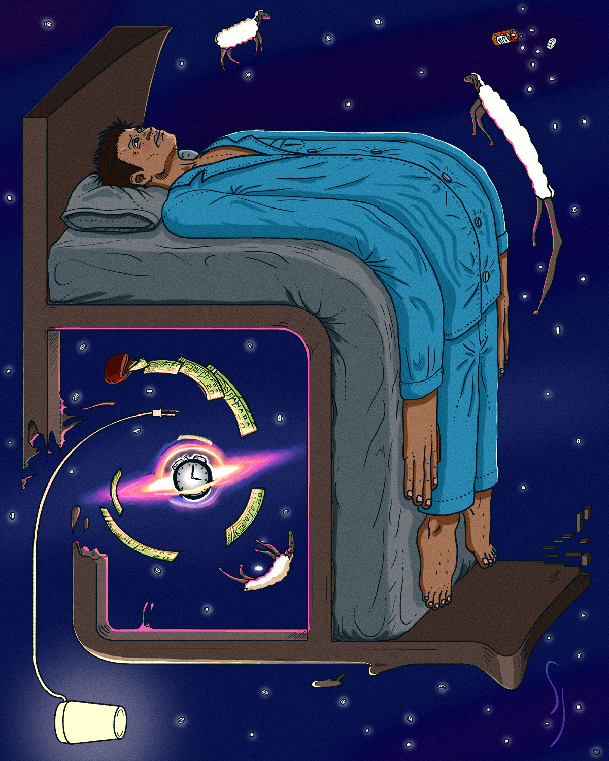
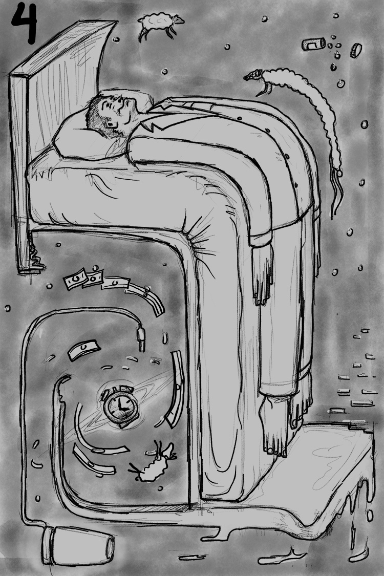
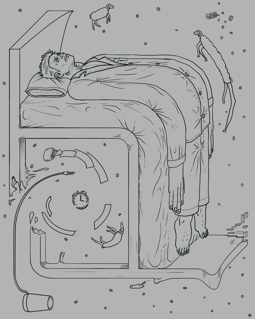
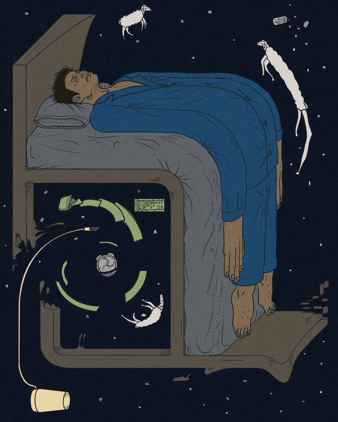
“Time Dilation” editorial illustration

Final project for the Domestika course “Surrealist Illustration” taught by Kyle Ellingson.
Sleep is something very precarious for me. The slightest variation in light, temperature, humidity, and other minute factors can leave me tossing and turning for hours. Then there are the random bouts of anxiety that wake me up in the middle of the night. “I guess I’ll just be awake for the next three hours! All right!” I felt this would be rich subject matter for the course assignment, which was to produce a surreal illustration representing a conflict between myself and something in my living space.
Surrealism, to me, almost requires the laws of physics being distorted. And there’s nothing quite as weird as the physics of black holes, including the “spaghettification” effect that happens as objects approach the event horizon and get stretched by gravity. The black hole distorts time and space, and I tried to portray both of those distortions in this image. Time and space both seem to break down when I’m lying awake, trying to fall back asleep.
Everything in the illustration is affected by the physics of the black hole, which is actually an alarm clock. I don’t have a traditional alarm clock like this (mine is actually part of that round lamp in the bottom of the frame) but this type of alarm clock is more iconic.
In sleepless moments, one worry I have is about how productive or energetic I’ll be the next day, or how the sleeplessness will affect my mood. I represented that worry as money getting sucked up by the black hole, because productivity is ultimately a concern about performance in the economic system.
The “stars” in the background are actually tiny pills. They aren’t sleep medication, but I do take supplements to help me sleep better. I also have to take a prescription medication for another deficiency at certain time of day, and keep that medication on my night table. So pills have a physical presence in my sleep space.
And finally I wanted to add some lost sheep, to represent the old bedtime technique of counting sheep. I don’t actually use that technique, but it does visually connect to the idea of sleeplessness. I also couldn’t let those poor sheep escape the relativistic effects of the black hole, could I?
This illustration is a featured project on the course page.


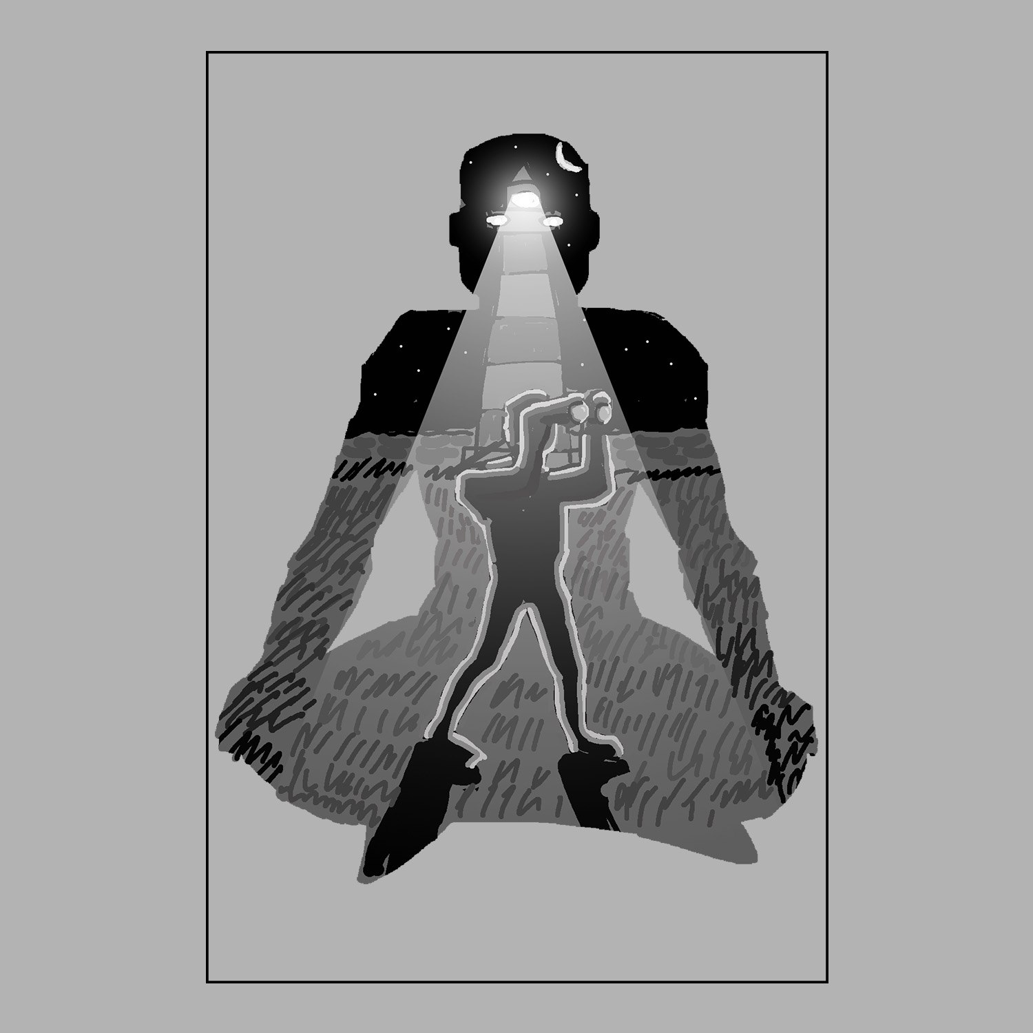
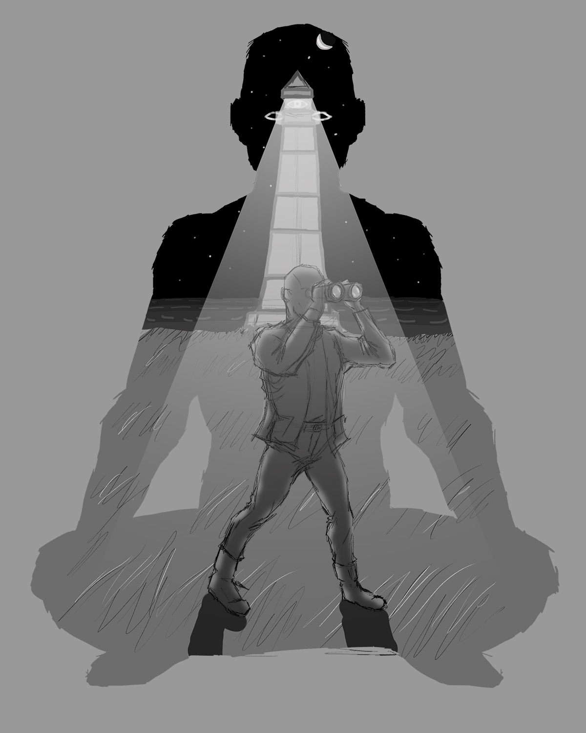
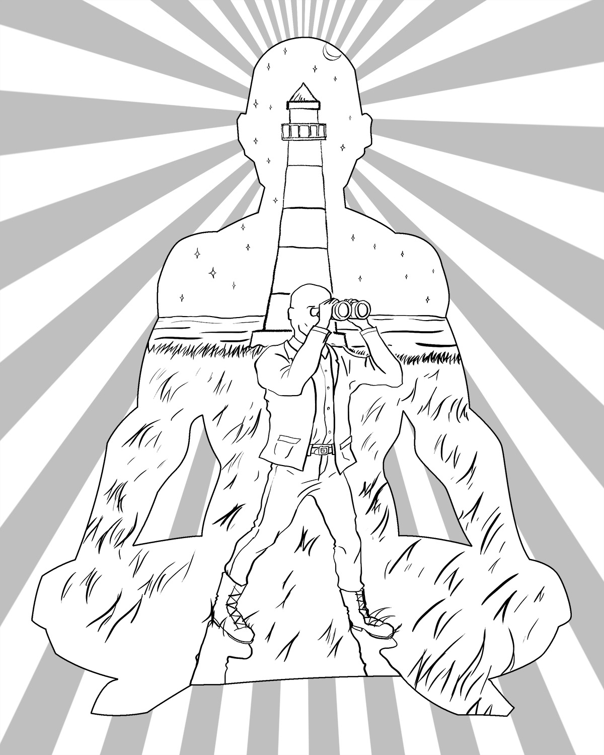
“Soul Searching” editorial illustration

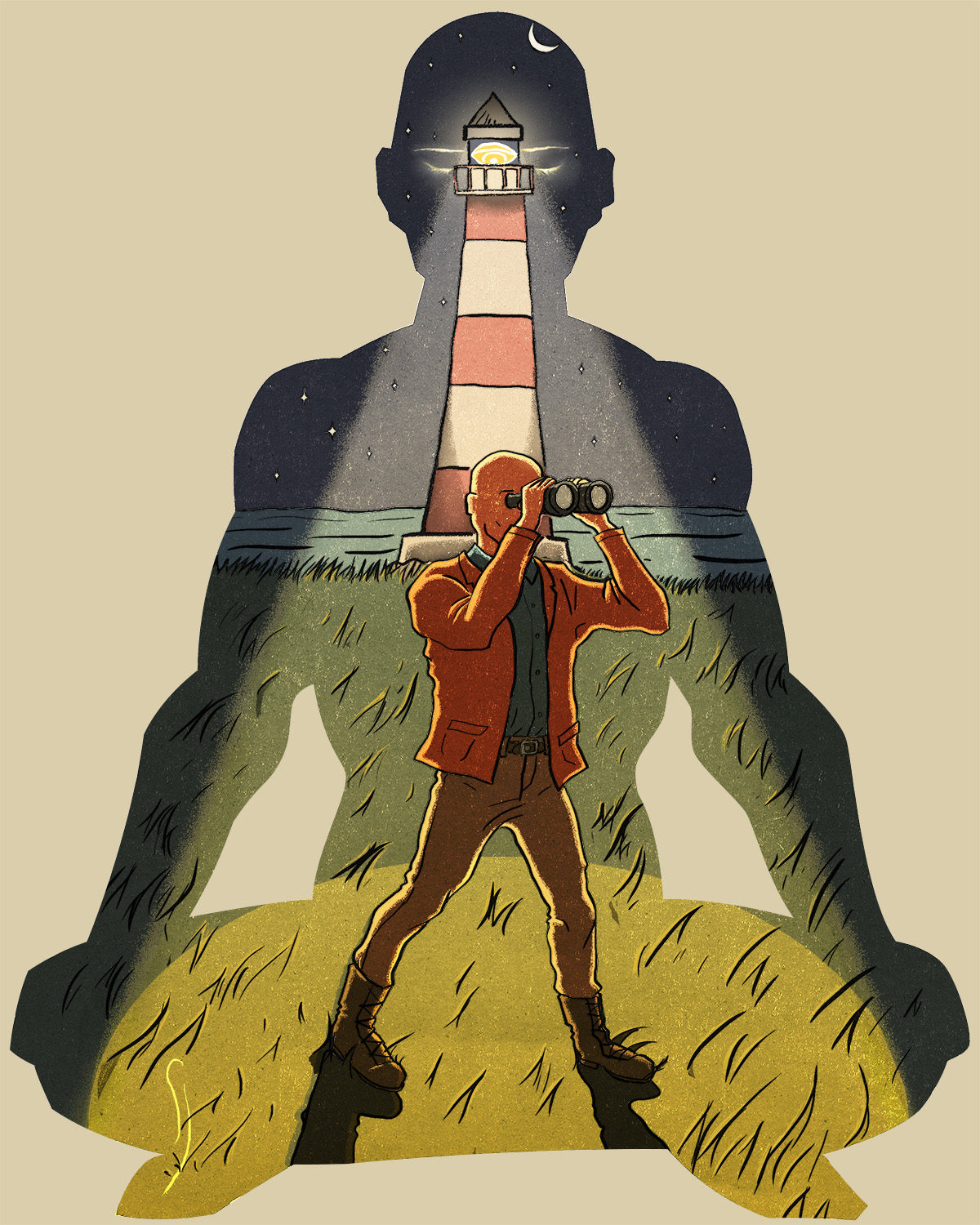
Final project for the Domestika course “Editorial Illustration From Concept to Published Artwork” taught by Tim Peacock.
We had to create an editorial illustration based on the theme “Learn something about yourself.” After some brainstorming, I decided to illustrate a variation from the original theme, a literal interpretation of the concept of soul searching. I was intrigued by that idea, and after some sketches, I felt it explored the theme in a fresh and different way (at least relative to my other early ideas).
I started with the outline of a person in a cross-legged meditation pose. Within this outline, we see the person’s inner world. That inner world is illuminated by a lighthouse, which aligns with their third eye (“third eye” is a concept from some Indian religions relating to a form of insight or spiritual awareness). The lighthouse is illuminating the way for the self’s exploration in the inner world of thoughts and emotions. We don’t see what the person learns or discovers; I left that off-screen to focus more on the search rather than the discovery. So the illustration is meant to relate to psychological and therapeutic themes of self-exploration, inner healing, dreams, and so on.
I also found the “third eye” a bit challenging to portray. I considered making the lamp from the lighthouse much larger and almost like an eye-shaped lamp, but the concept felt too similar to the Eye of Sauron from the Lord of the Rings films, which therefore made it sinister and oppressive.
In terms of technique, I generally used similar techniques to what instructor Tim Peacock showed in the course. This gave the piece a very appealing ligne claire style which I hadn’t tried before, but fondly reminded me of Tintin comics I read in childhood.