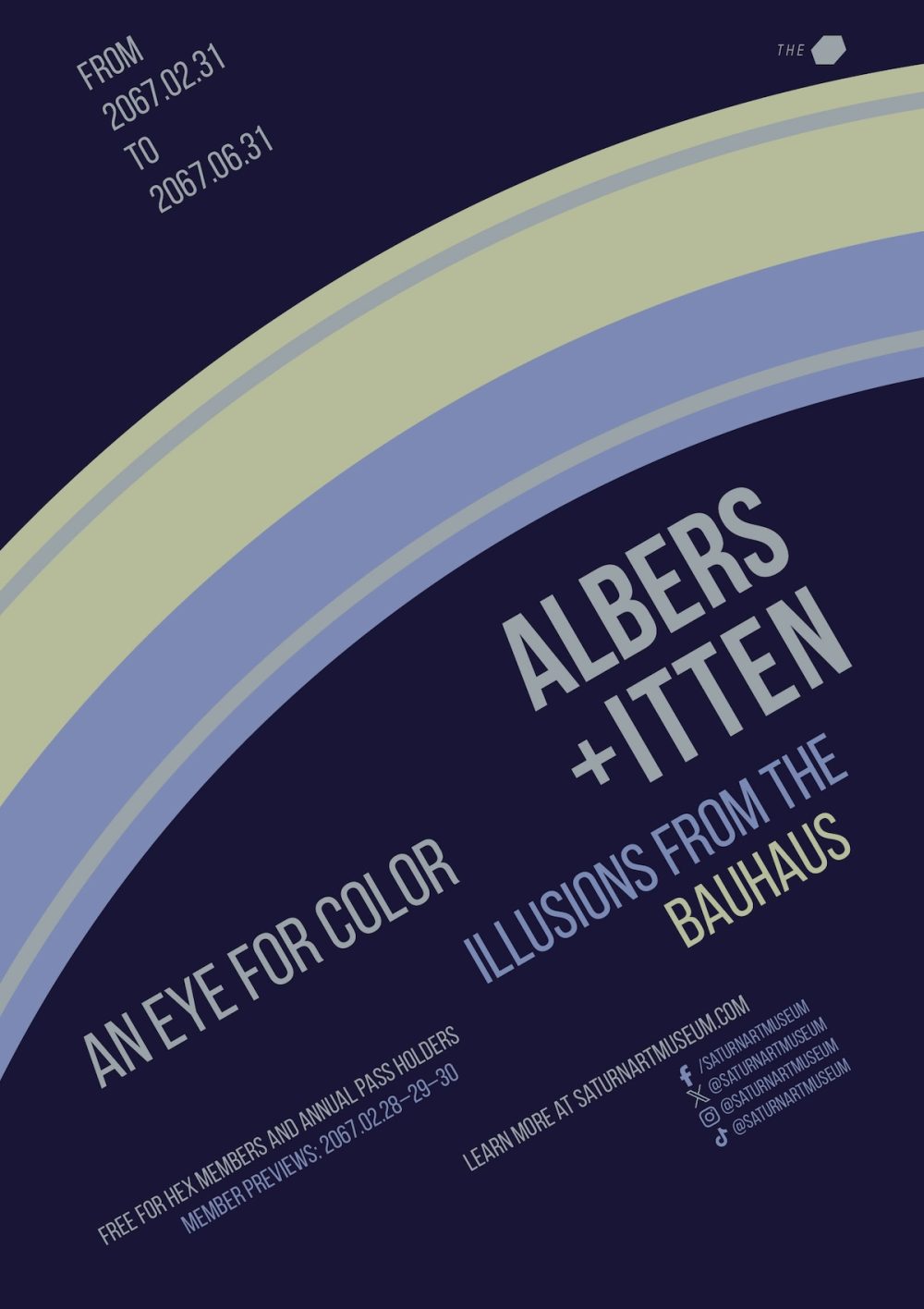
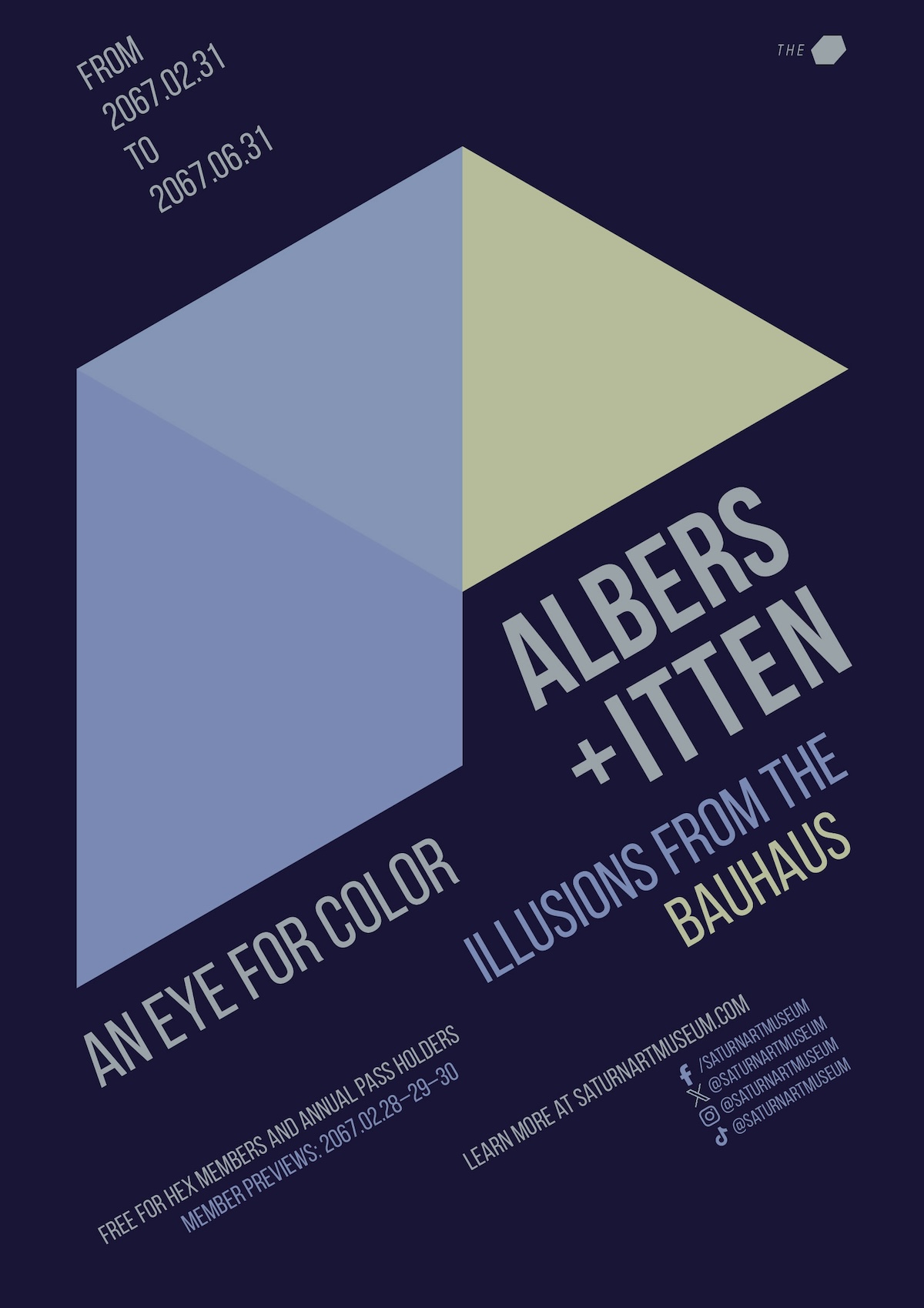
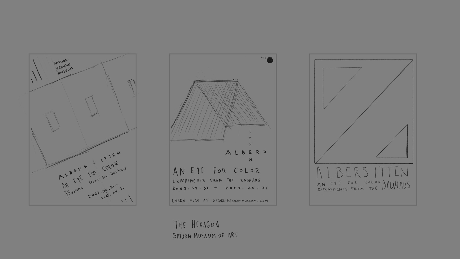
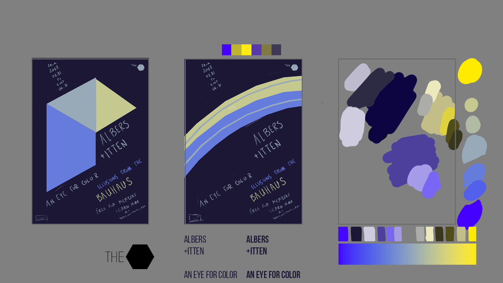
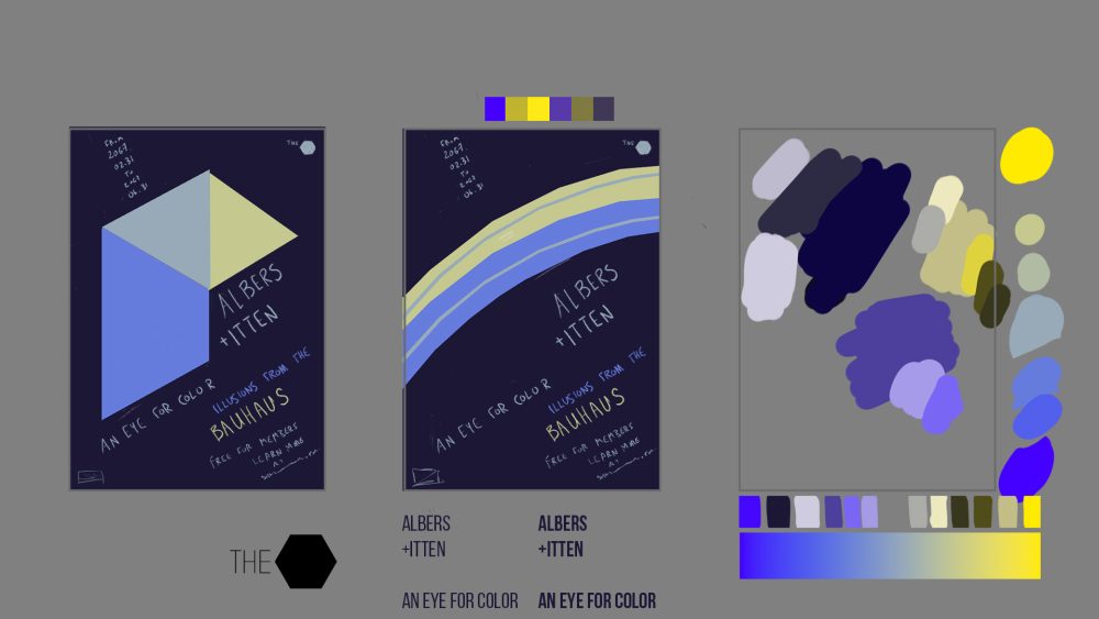
Final project for a Domestika course taught by Richard Mehl about the colour theory of Bauhaus designers Josef Albers and Johannes Itten. We had to create a museum poster for a fictional exhibition about illusions generated by their teachings. These illusions include the use of colour relativity to trick the eye into believing there are more or fewer colours in the image than there really are. For example, in the rings image, the thin rings inside the big rings are supposed to look like the opposite colour, even though they’re actually an entirely separate shade of grey. Then in the folding image, there’s an illusion of transparency created with different shades of colour rather than with blending modes or opacity changes.
I somehow decided this exhibition would take place in an art museum floating above the hexagonal cloud formation on Saturn’s north pole. Given that location, the museum would be nicknamed The Hex (the basis for its branding, seen in the upper-right corner). That location also influenced the design of the shapes and their colours. And yes, the dates of the exhibition take place in the future (and even on some impossible dates…maybe there’s a wormhole involved…).